I DELIVER VALUE
Let’s get to the point:
• My research creates effective strategy, which increases company profits
• My cross-functional communication creates efficiency, saving time
• My interactions and visuals increase customer engagement and satisfaction
Artificial Intelligence

I’ve been working with AI since 2022, before it became a buzzword and
before most teams knew what to do with it.
Now it’s part of how I design. I use it to break down complex problems, explore solutions faster, and remove friction from
the product cycle. The result is simple: faster execution, better decisions, and less guesswork.
AI isn’t replacing good design. It’s exposing who knows how to think.
Here’s exactly how I use it and where it actually drives results.
Previous Companies
As a professional UX designer with over ten years of experience, I am proud to say that since the start of my career in 2012, I have had the opportunity to work with several reputable companies and corporations, each of which has provided me with invaluable learning experiences. Throughout my professional journey, my focus has been on adding value to the organizations I have worked with, and my contributions have consistently led to increased company profits, as well as the creation of software products that are better, faster, more efficient, and more cost-effective. Please find below some links that will direct you to additional pages containing supplementary content.


Schwab Two-Step Login
I was tasked with creating solutions to Schwab.com’s login experience. To increase security, I needed to convert the previous one step experience to two steps. I researched, iterated, and narrowed down ideas. After presenting my findings to product owners, we arrived at a final decision, which is currently in production. You can read about these efforts on this page or open the PDF presentation here:
OPEN PDF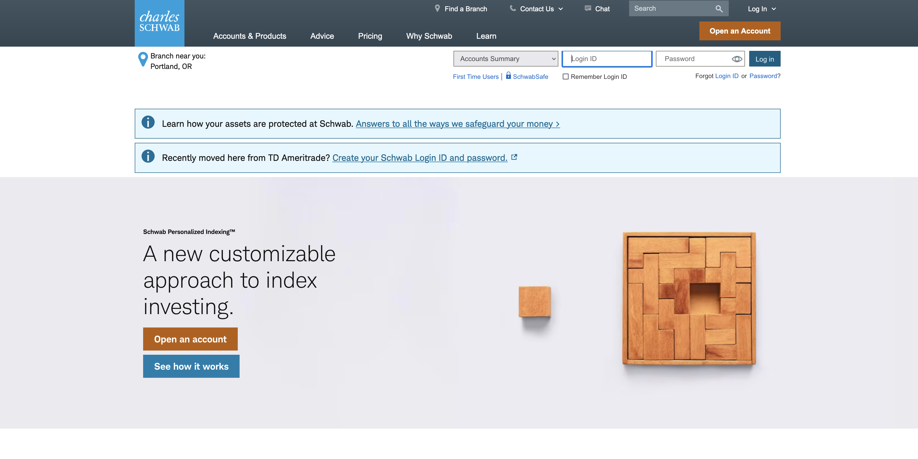
The Schwab.com home page includes Login ID and Password fields in the header. My goal was to help users log in safely and securely.
Two-Step Research
My competitive/comparative analysis demonstrated many examples of websites that stack the login and password fields. This was used to reinforce my decision to design a solution which also stacked the fields.
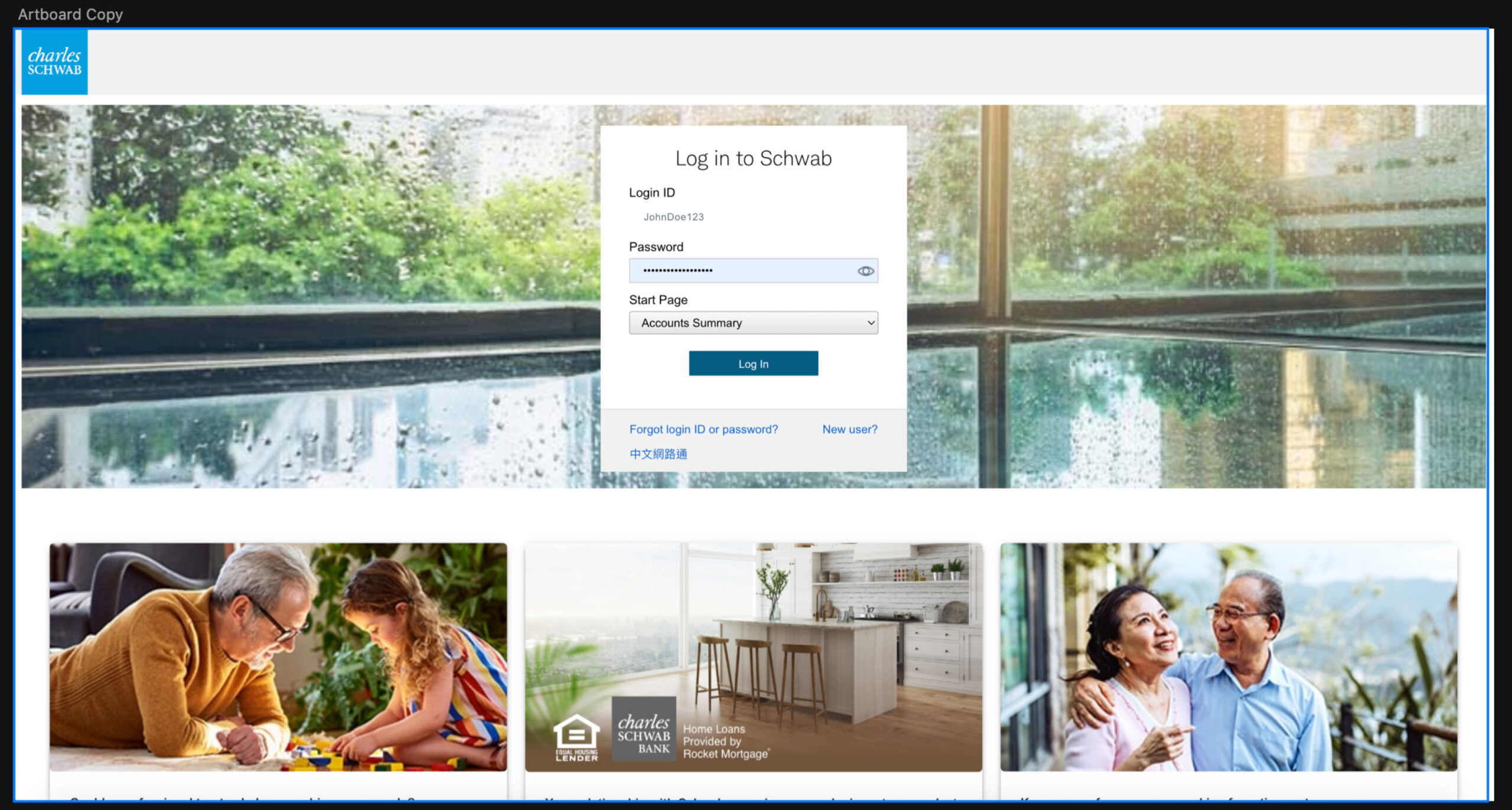
Two-Step Option #1
The first concept allows the user to first enter a login, and when they hit the login button, the next page shows a previously created stacked login experience. Pros: Users had grown accustomed to this login method previously, and since there was no tech lift, PO’s knew it saved time and devs could quickly complete it. It was the fastest and easiest option. Cons: Even though users might be used to this, I did not recommend it because going from one page to another may be too jarring and might reduce user trust.
VIEW OPTION #1
Two-Step Option #2
The second concept displays the stacked login directly in the hero image on the home page. The user inputs credentials from here and is taken to account summary. Pros: Many competitor’s examples show the login on this area of the page, the action is clear and it’s a good use of space. Cons: More development time would be needed for this solution and our product team was concerned that marketing may push back about using some of their real estate.
VIEW OPTION #2
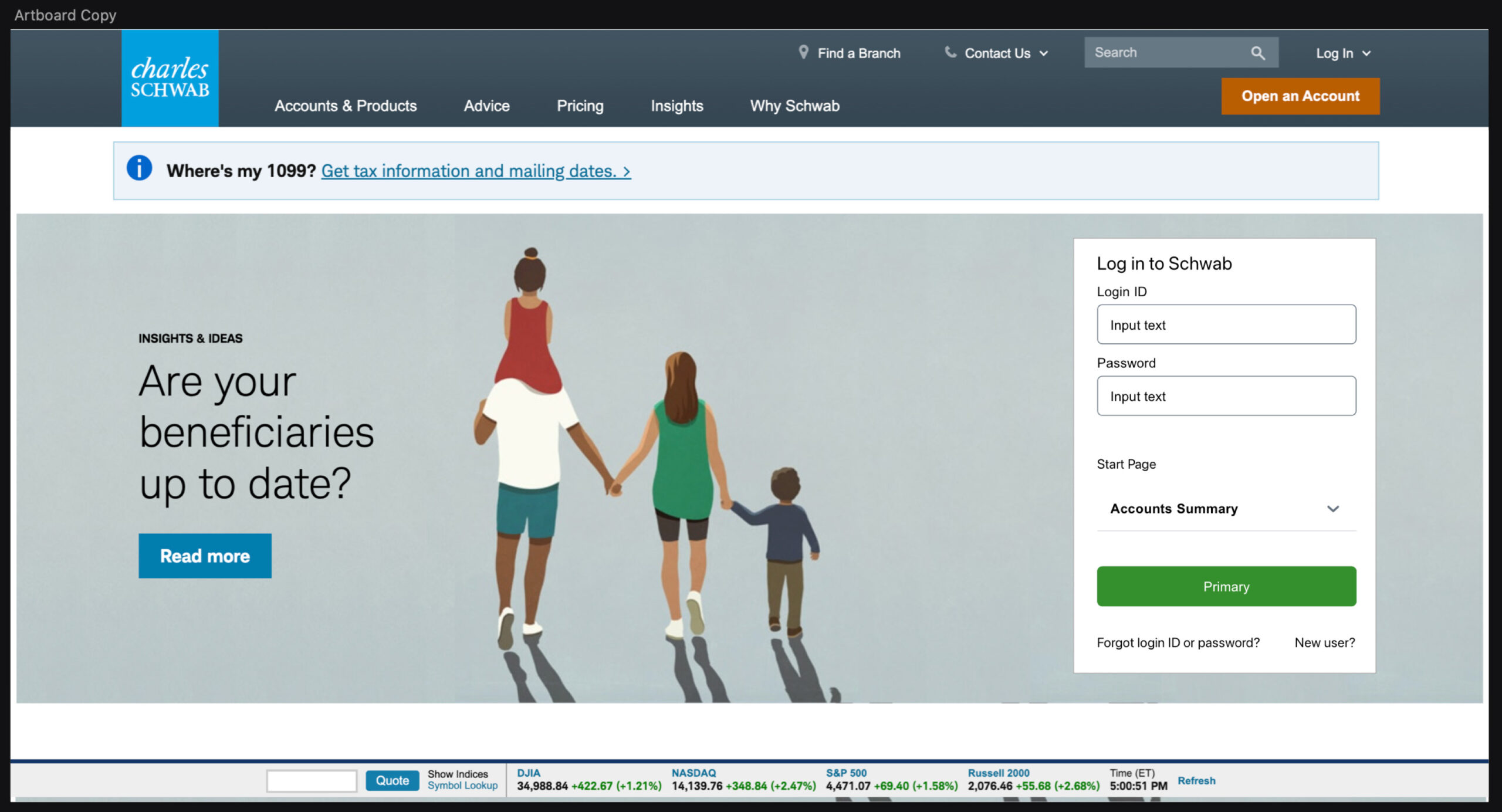
Two-Step Option #3
The third concept shows how the login field would stay in the secondary header, but on click, a slider would animate from the right, allowing password input. This was my recommendation. Pros: The user stays on the same page, their focus would zero in on the primary action, it doesn’t use any marketing space and it’s the most future-proof option, additional real estate for further future enhancement Cons: It was the heaviest tech lift and not a previously establish pattern.
VIEW OPTION #3
SCHWAB
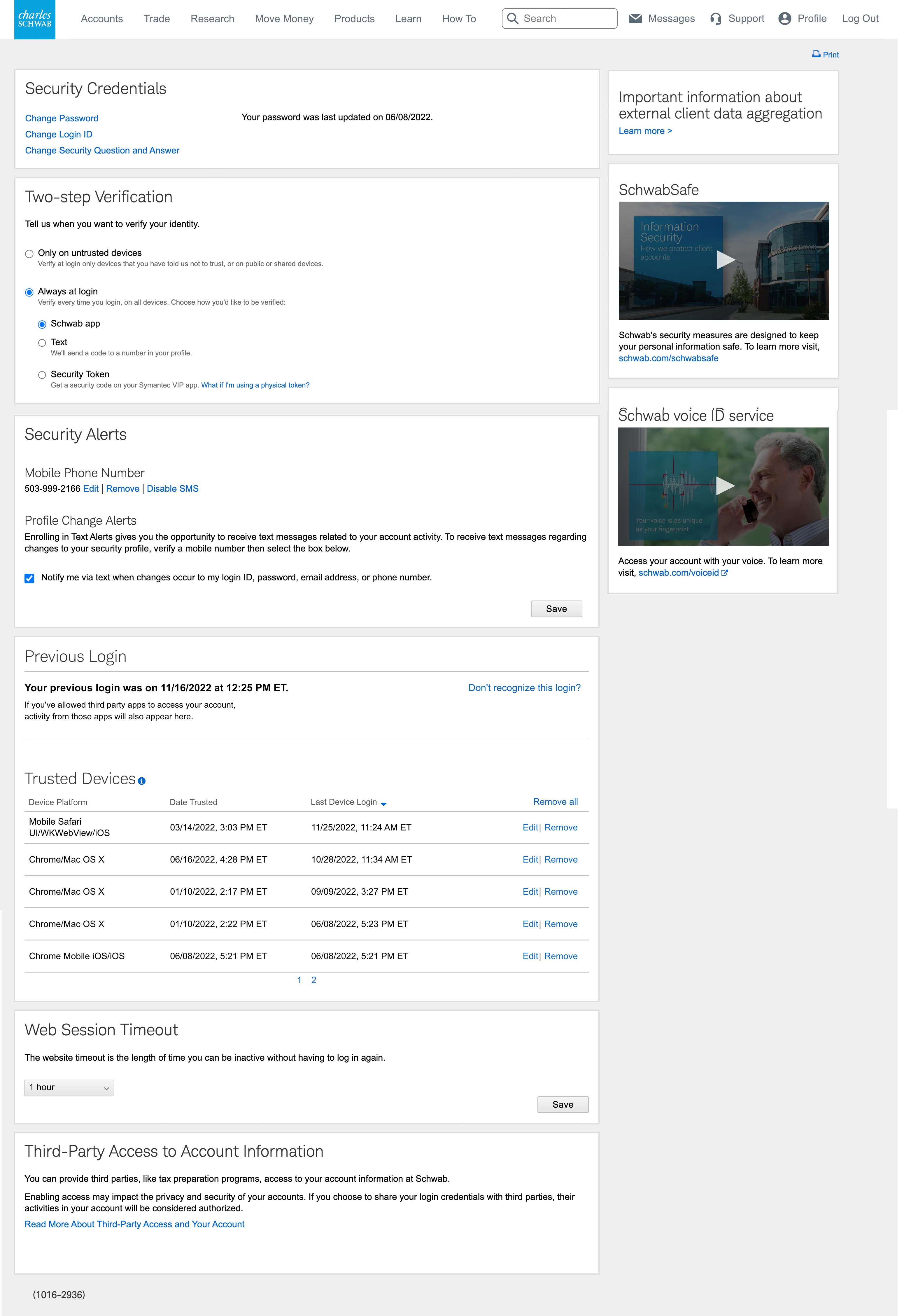
Security Center
After users log in to Schwab.com, they have the option to adjust settings in Security Center, an area that contains ways to monitor alerts, logins, credentials and more.
My task was to create an area that displayed user login info and which devices were trusted, using existing components and patterns.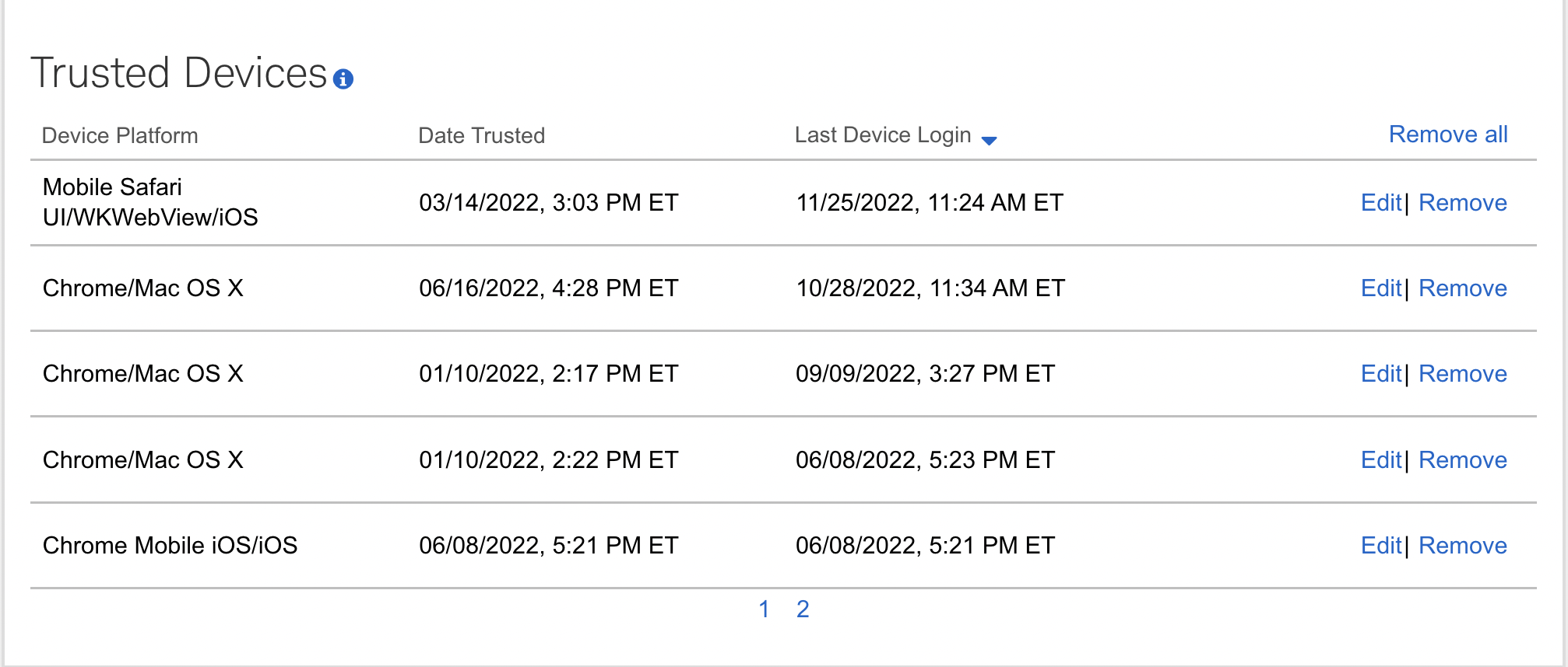
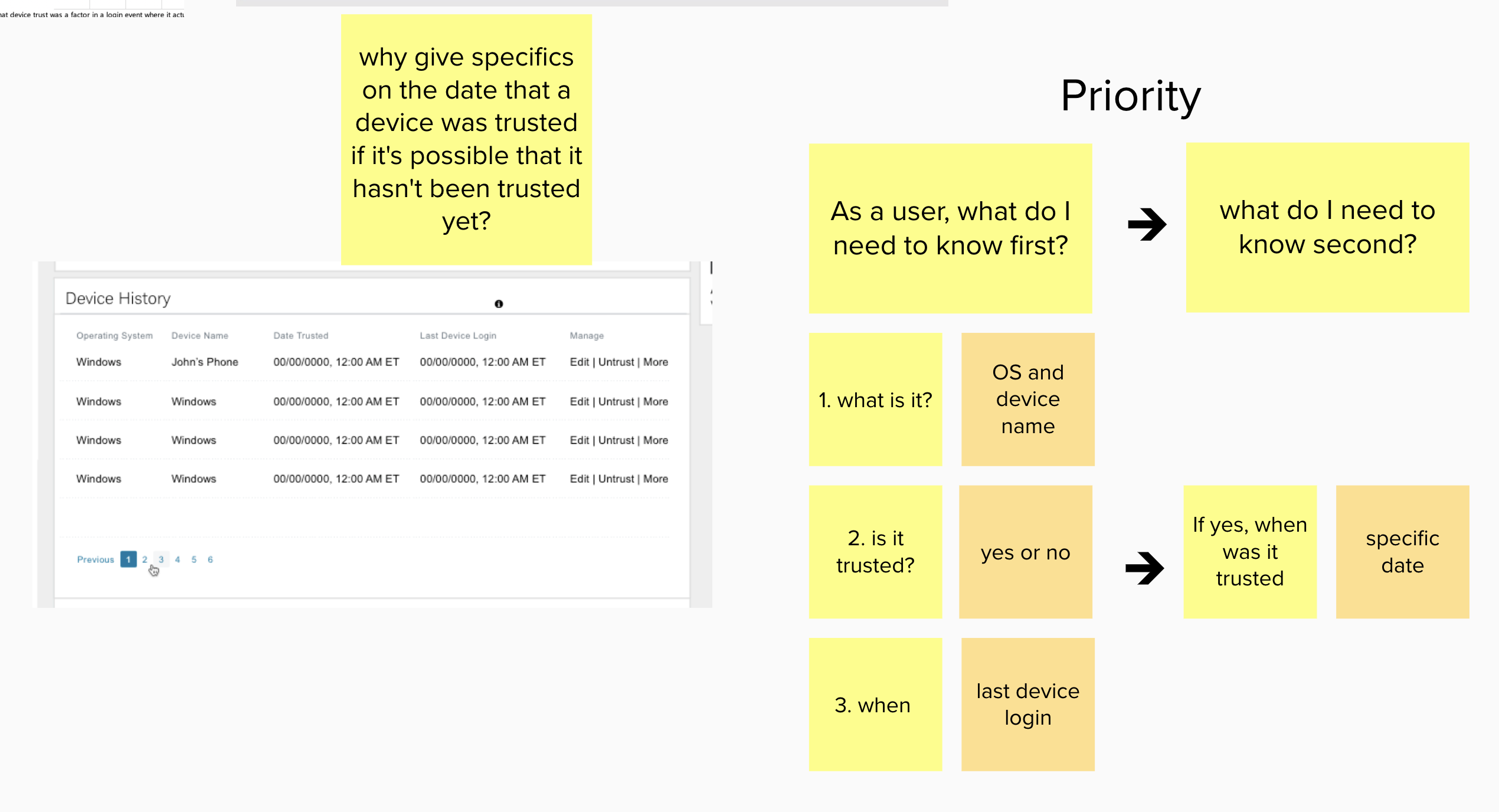
Security Center Research
Since I assumed this section of Security Center would stay as table data, I searched the internet and did some comparative/competitive analysis to gain inspiration. In Mural, I ask a lot of questions with stickie notes. It helps me identify the appropriate components and interactions. For this project, I was nailing down the priority of the info to make it easier for the user.
Security Center Solutions
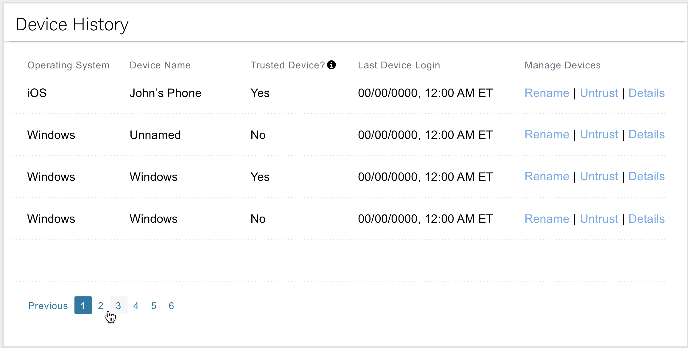
Security Center Option #1
The first concept mixes device history with last device login information. The first 4 columns are static data with all the interactions in the last column. Rename and Details open a modal, while Untrust is a toggle. Basic, but it gets the job done.
Pros: The table lists prioritized data, with all actions grouped neatly at the end, allowing the user to mentally digest the info first, then take action on it.
Cons: Renaming an item or toggling Trust/Untrust is a spatial disconnect, increasing cognitive load.
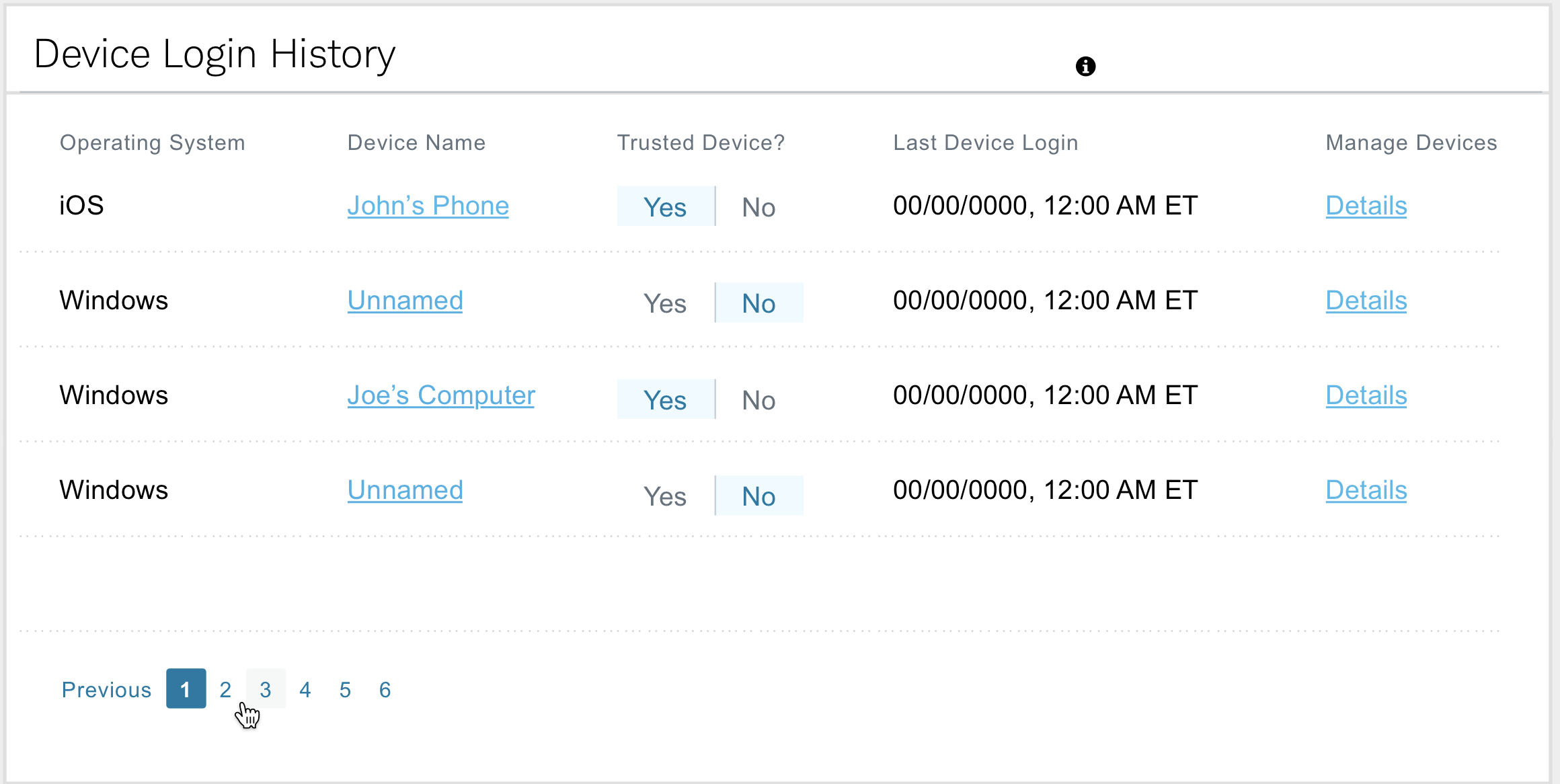
Security Center Option #2
For the second concept, interactions are in-line and editable where they sit.
Pros: Users can interact with the device name by clicking it, editing and saving in same area. It’s visually evident which devices are trusted and which one’s aren’t. Details is the only link that opens a modal. It’s organized, functional and balanced.
Cons: Custom coding may have been needed to implement this functionality and it wouldn’t be consistent with any previously established pattern.
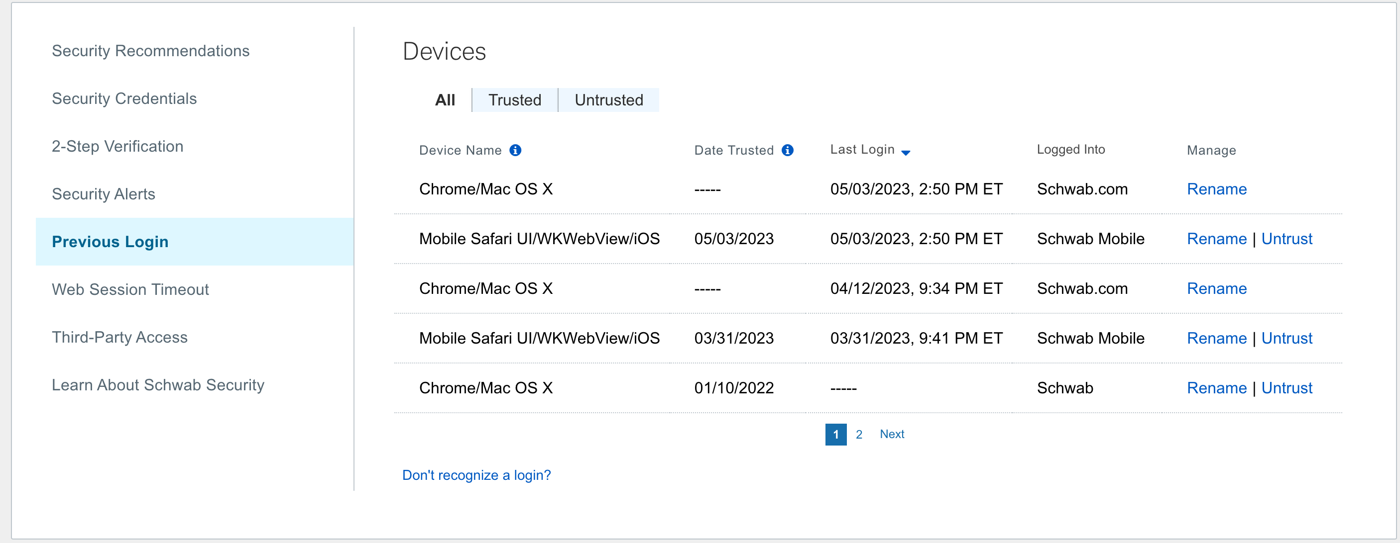
Final Implementation
After all the revisions, the product owners decided on a variation of Option #1 because of technical limitations.
Device name, date trusted, last login, logged into, manage were the columns that were included.
The product owners vowed to return to this project in a later quarter after this MVP was put into production.
Patterns
An additional aspect of my role was to establish design patterns for specific areas of Schwab.com for desktop, tablet and mobile. We were required to create consistent visuals while adhering to our corporate design system. I delivered many of these in Sketch and Figma, within sprint schedule.
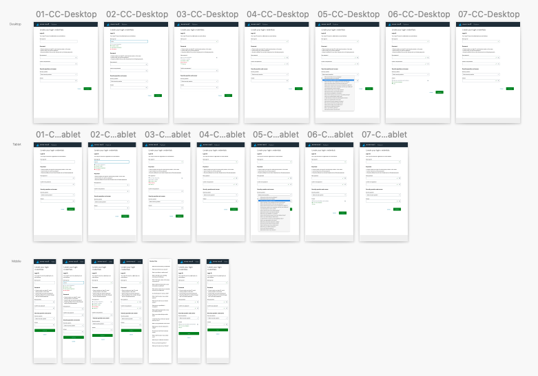
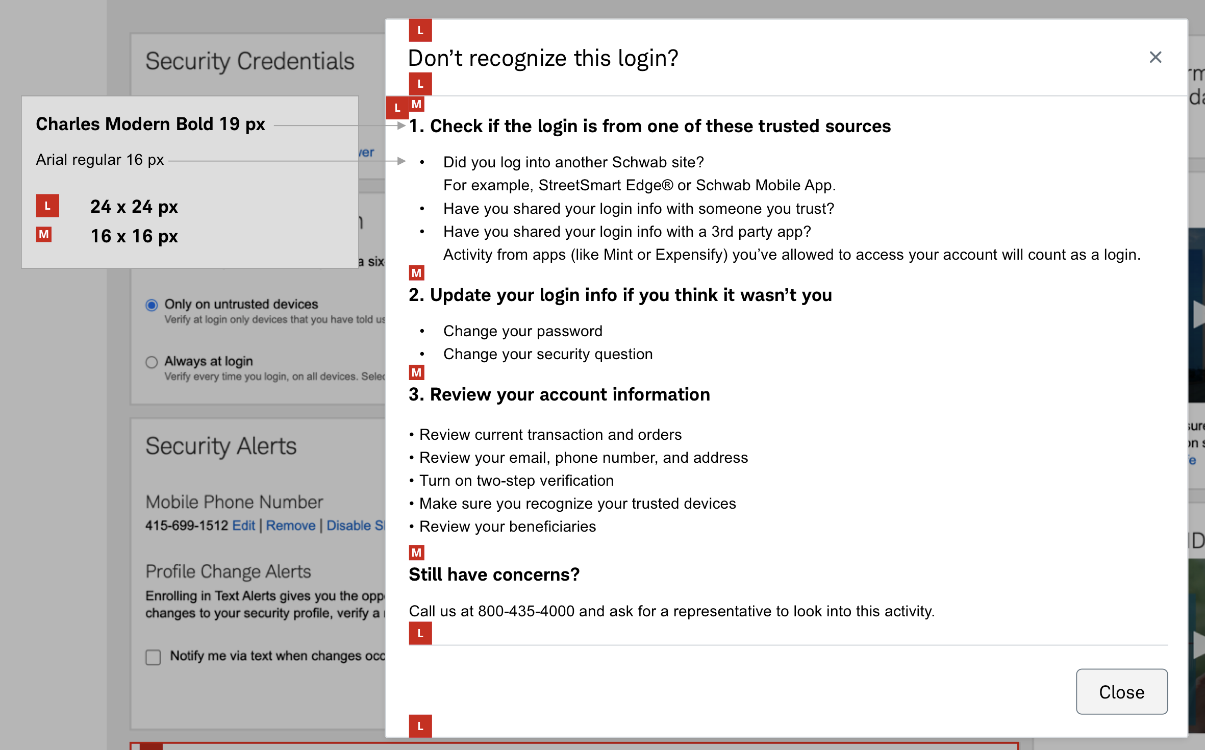
Redlining
Before Figma, we used to create redline documents that clearly call out spacing and type sizes. Sometimes, these can still be useful for those that don’t inspect the code with a browser.
Signed, sealed, delivered
View the details of these Schwab projects and more, in one convenient PDF. Hit the button below to view in a new tab.
OPEN PDFDAIMLER TRUCKS NORTH AMERICA
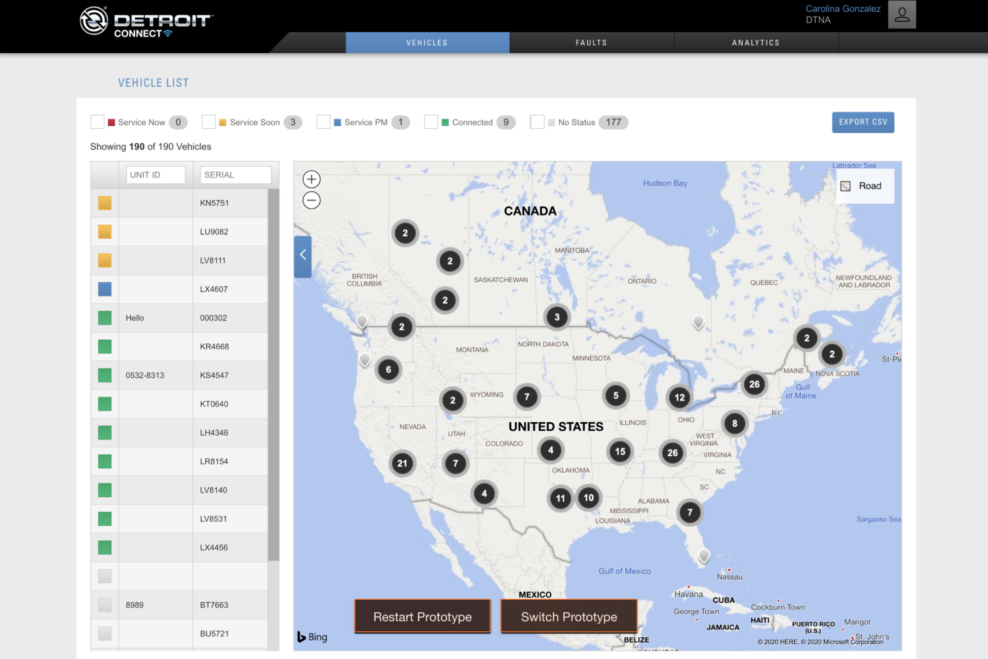
Detroit Connect Portal
In August of 2019, Daimler hired me to focus on a variety of UX responsibilities. You can read about them on this page or download the PDF here:
OPEN PDFDCP SIGN-UP PROCESS
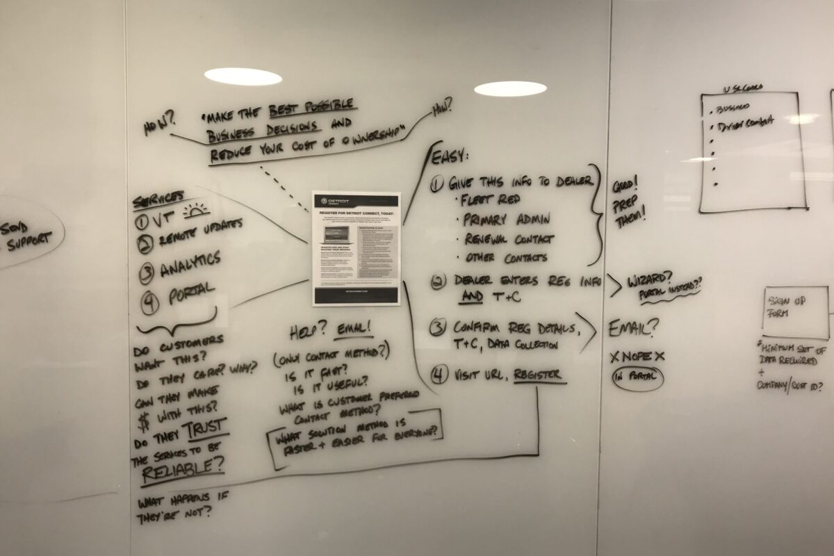
A vast majority of customers didn’t use the product. The flow was cumbersome. Approval process took weeks. The goal was to streamline, simplify and increase ease of use.
NEW FEATURES
Most product owners assumed high value functionality was in new feature implementation. Product designers like me are key to visualizing them and seeing them come to fruition.
REFINEMENTS
DCP’s primary purpose is to inform drivers and fleet owners of faults with the vehicles to keep them on the road. Data visualizations needed to be actionable to be of value.
BUG FIXES
Nobody liked to fix old problems, but it was important. Sometimes I had to put out fires. Sometimes the fires were under me, and I fully appreciated the importance of them.
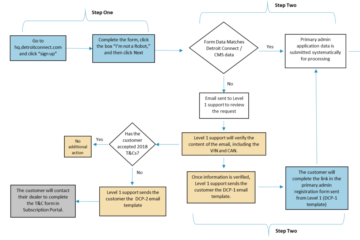
DETROIT CONNECT PORTAL SIGN-UP PROCESS
When only 10% of your customers use your product, something’s gotta change
Daimler throws in free software with the purchase of every vehicle to ensure it stays on the road. 90% of the customers didn’t use it. Why? That’s something I needed to find out.

DCP Stakeholder Interviews
When interviewing project managers, product owners and team leads, I was able to determine the current state of the product, future priorities, and employee motivations. My discovery revealed that many customers had a hard time finding value in DCP, and the team was mostly relying on their own knowledge and experience to drive strategy because of apprehension to speak with customers. Additionally, the daimler team preferred to initiate new features to provide value while customers needed existing features to be enhanced. It wasn’t enough that data was presented, the data needed to be actionable.


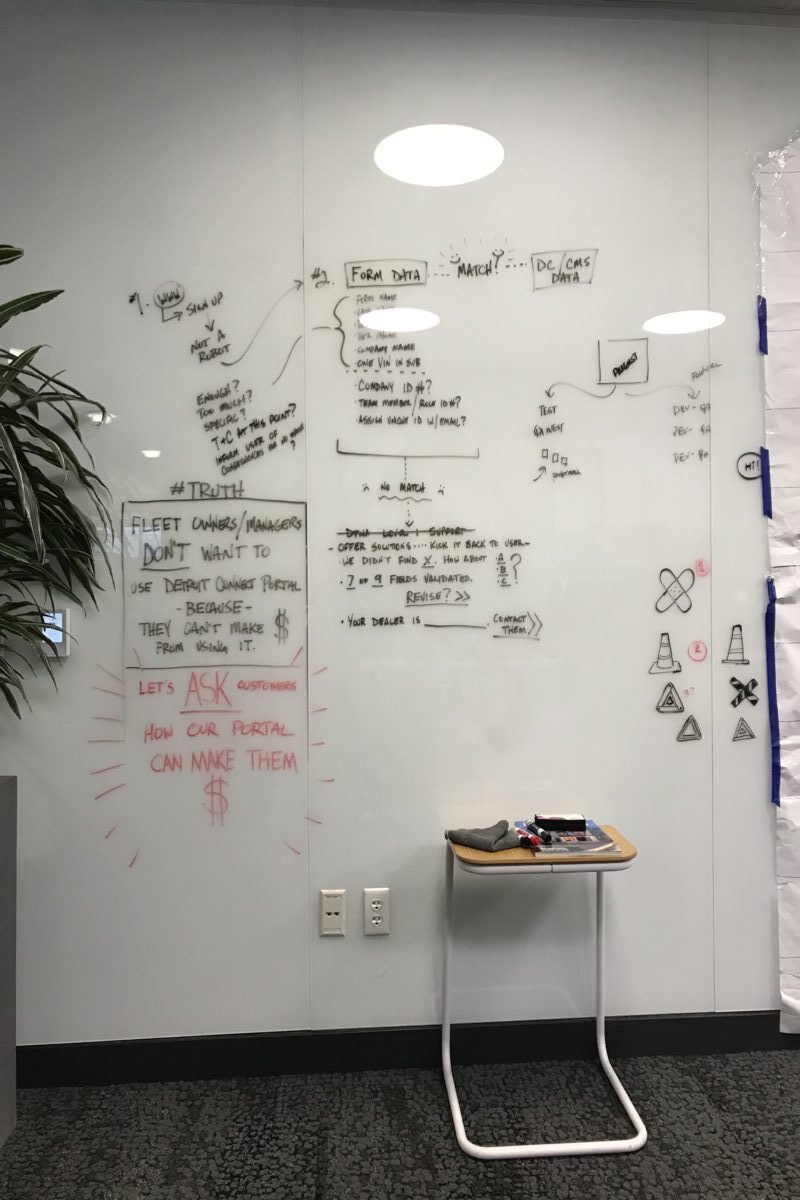
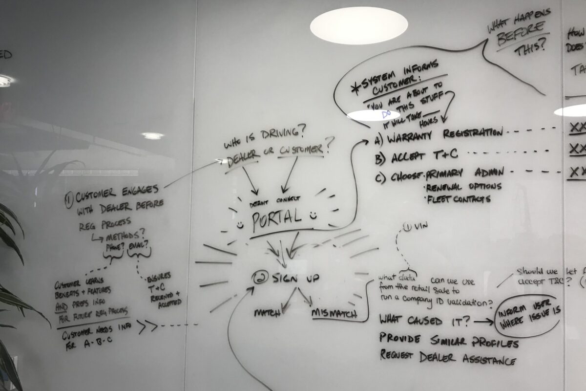
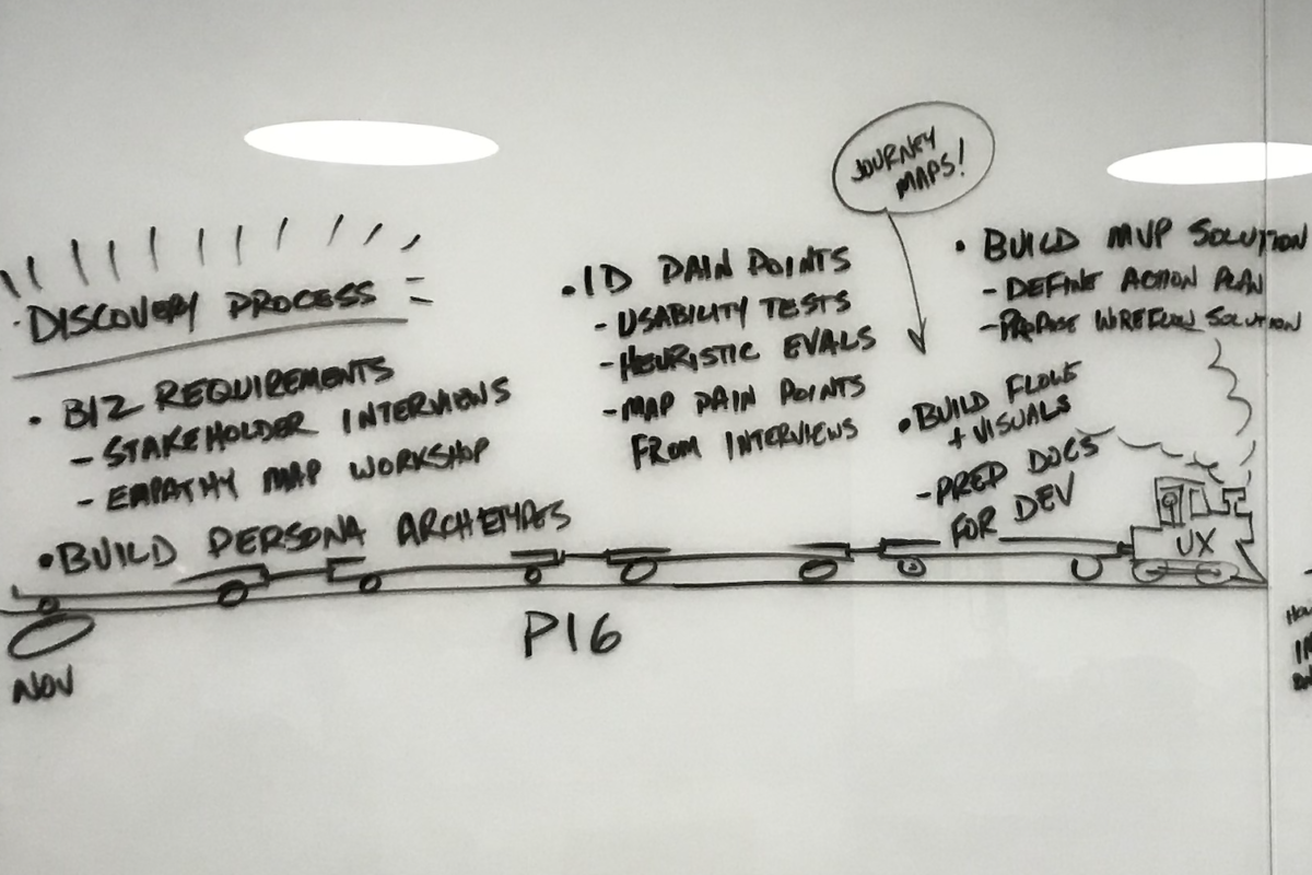
Whiteboard Brainstorming
It was helpful to have massive whiteboards near my cubicle. It gave me the freedom to take whatever I was thinking about the project and share it with everyone who passed by. To be honest, some folks preferred to not follow the same strategies and ideas that I had, but I was only there to help the product become more successful.
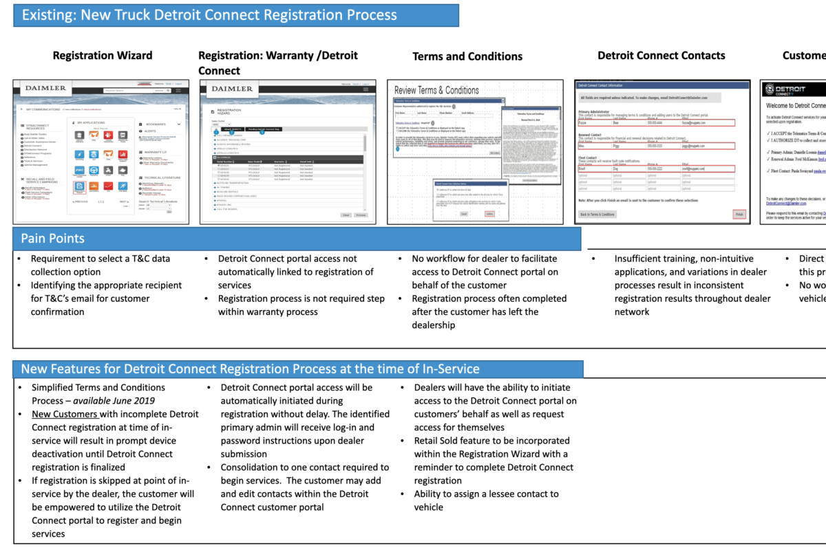
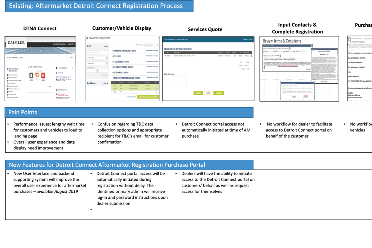
Previous DCP Registration Process
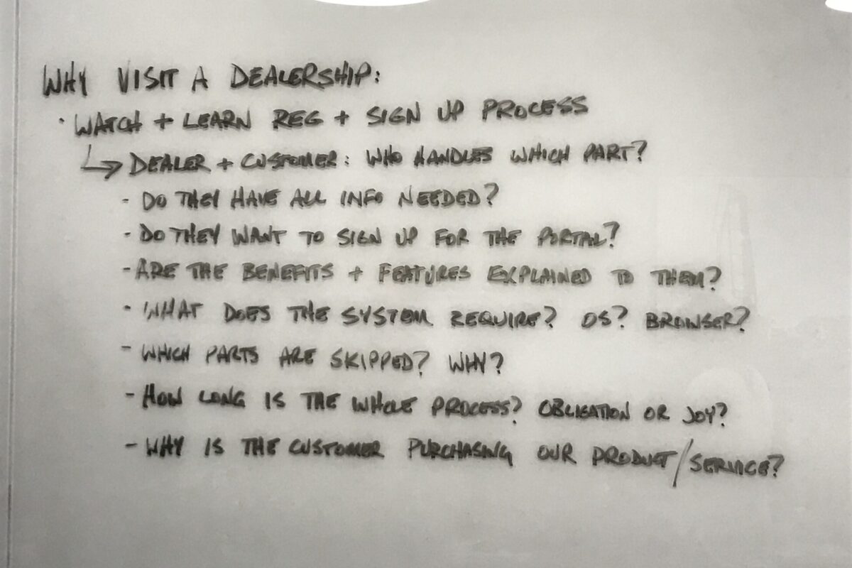
After doing some digging, I found that the registration process took too long to complete, asked too much information, bounced from site to site which could be visually confusing, and the manual checking after the fact took way too long.
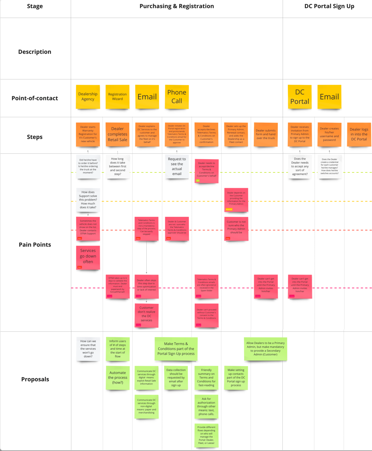
DCP Sign Up Research
This mood board demonstrates the points of contact, steps, pain points and possible solutions for them. I collaborated with one other designer to generate some of these findings. This phase is actually the most fun for me. Looking at the state of the world, mapping it all out, nailing down all the problems and then ideating solutions. Even though my colleague and I had not been in the trucking business for 20 years, our inexperience in the industry was to our benefit. I brought a fresh perspective to this process.
VIEW MOOD BOARDDCP Revised Sign Up Flow
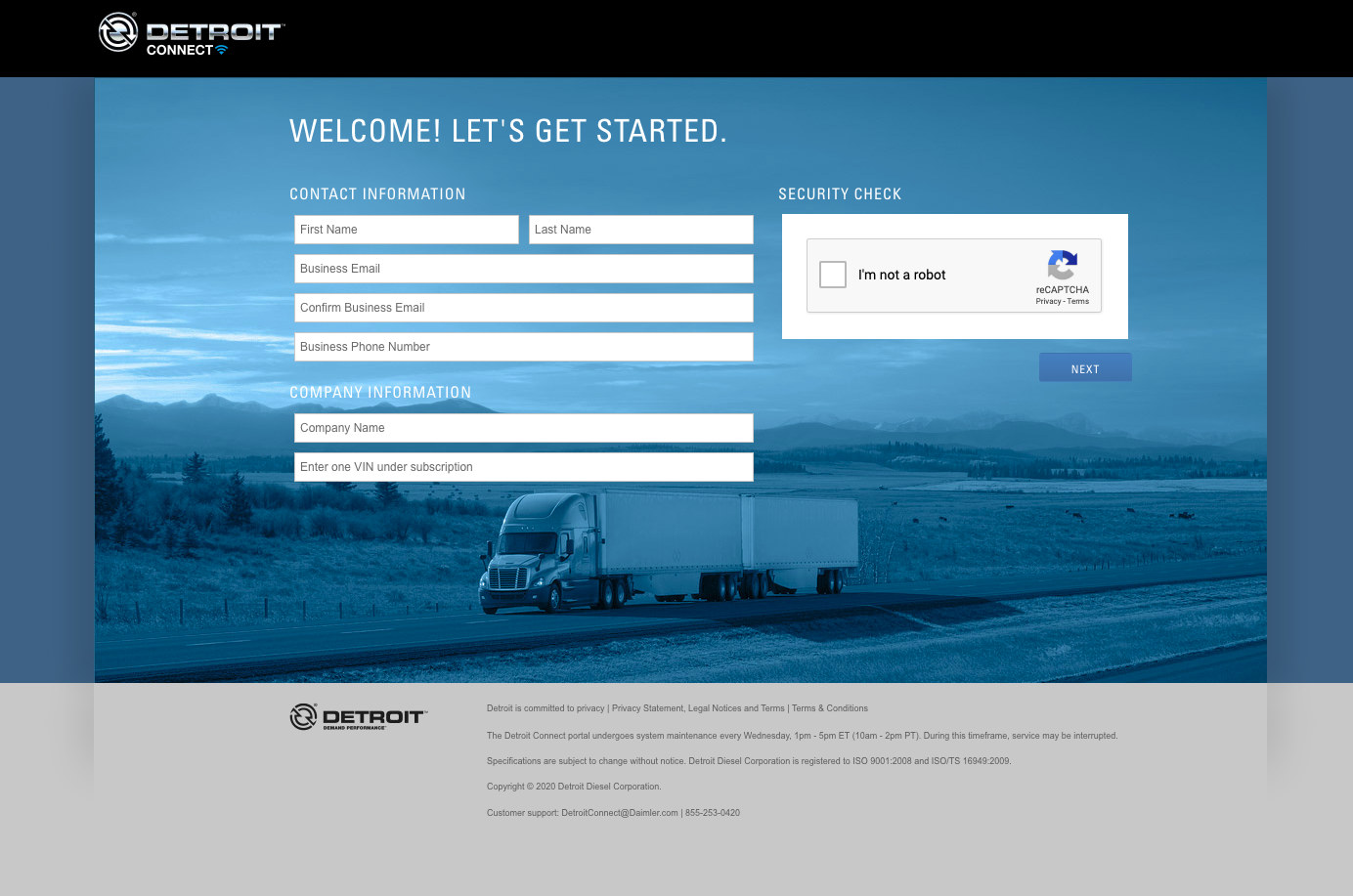
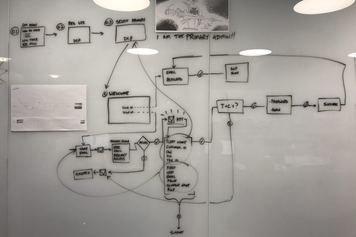
The previous process involved multiple sites, lengthy forms and a manual approval process that took weeks. I sought to eliminate that and this is the alternative I introduced.
I chose a simplified version of this process because, through our interviews, we learned that most users were between 35-65 years old and knew more about driving trucks that operating computers. They did not need to navigate a cumbersome system that bounced to different sites with forms requiring difficult to find information, and an approval process that took weeks. They needed a fast, easy and convenient sign up, much like other systems that most of the world uses.

Step 1: Hit Sign Up
On the initial page, the user would first click Sign Up.
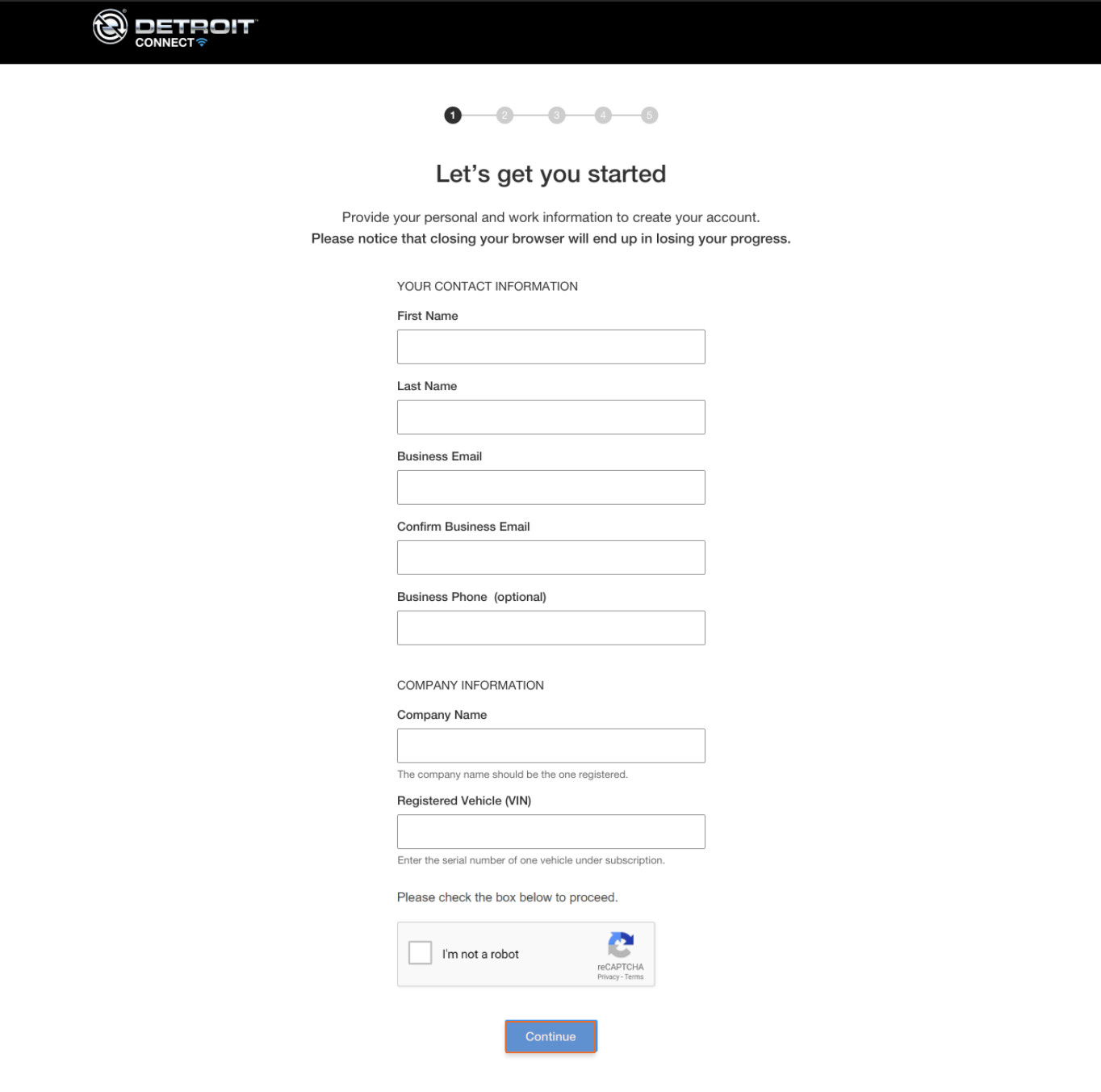
Step 2: Form completion
The stepper indicates length of process. Only the initial information is required.
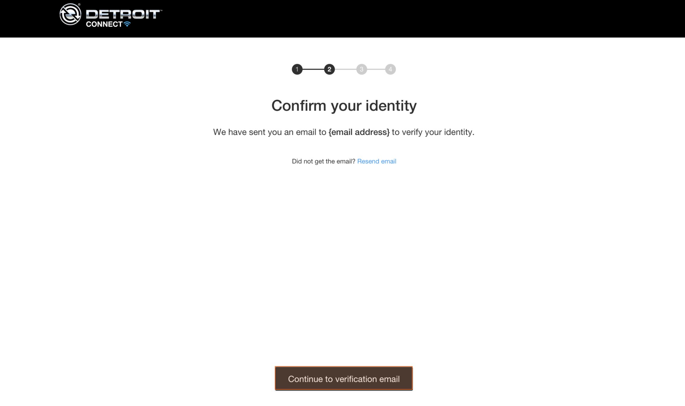
Step 3: Confirm identity
Gotta prove you are who you say you are.
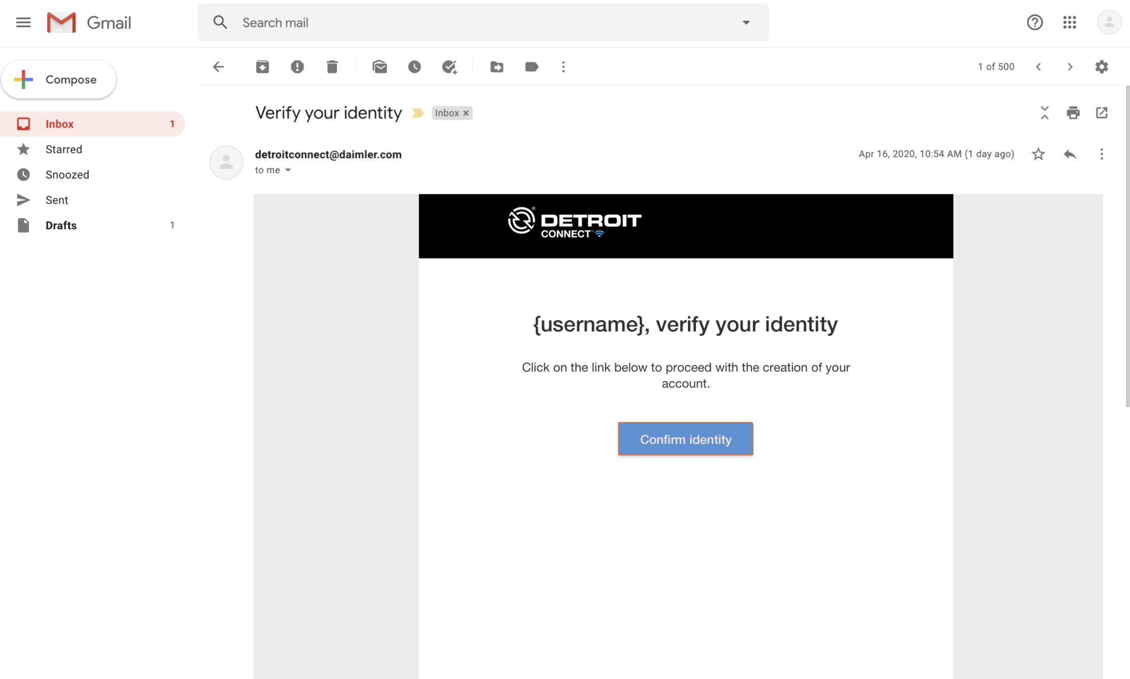
Step 4: Verification email
Approval process now takes seconds instead of weeks.
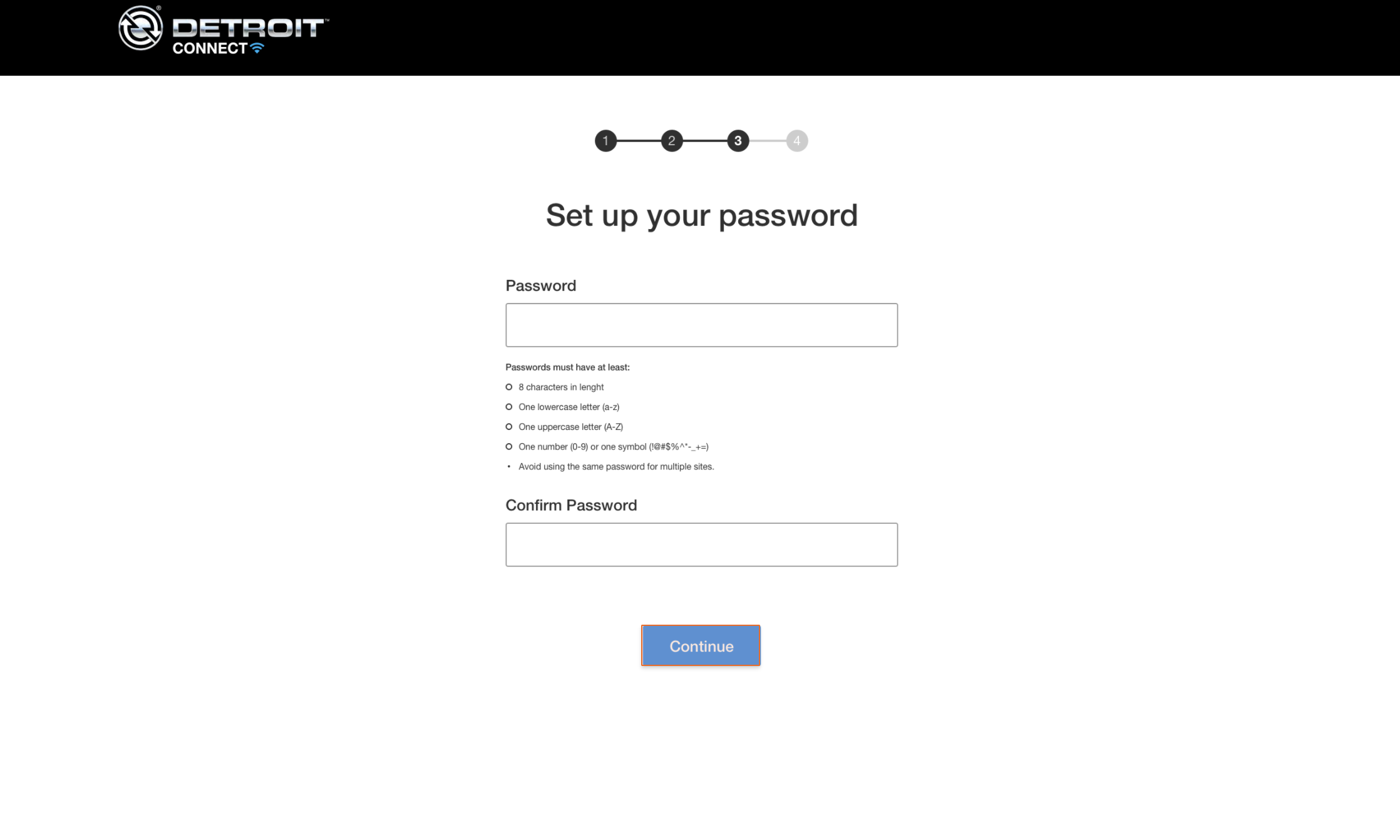
Step 5: Enter password
Before 2 factor authentication is activated, an initial password should be set up first.
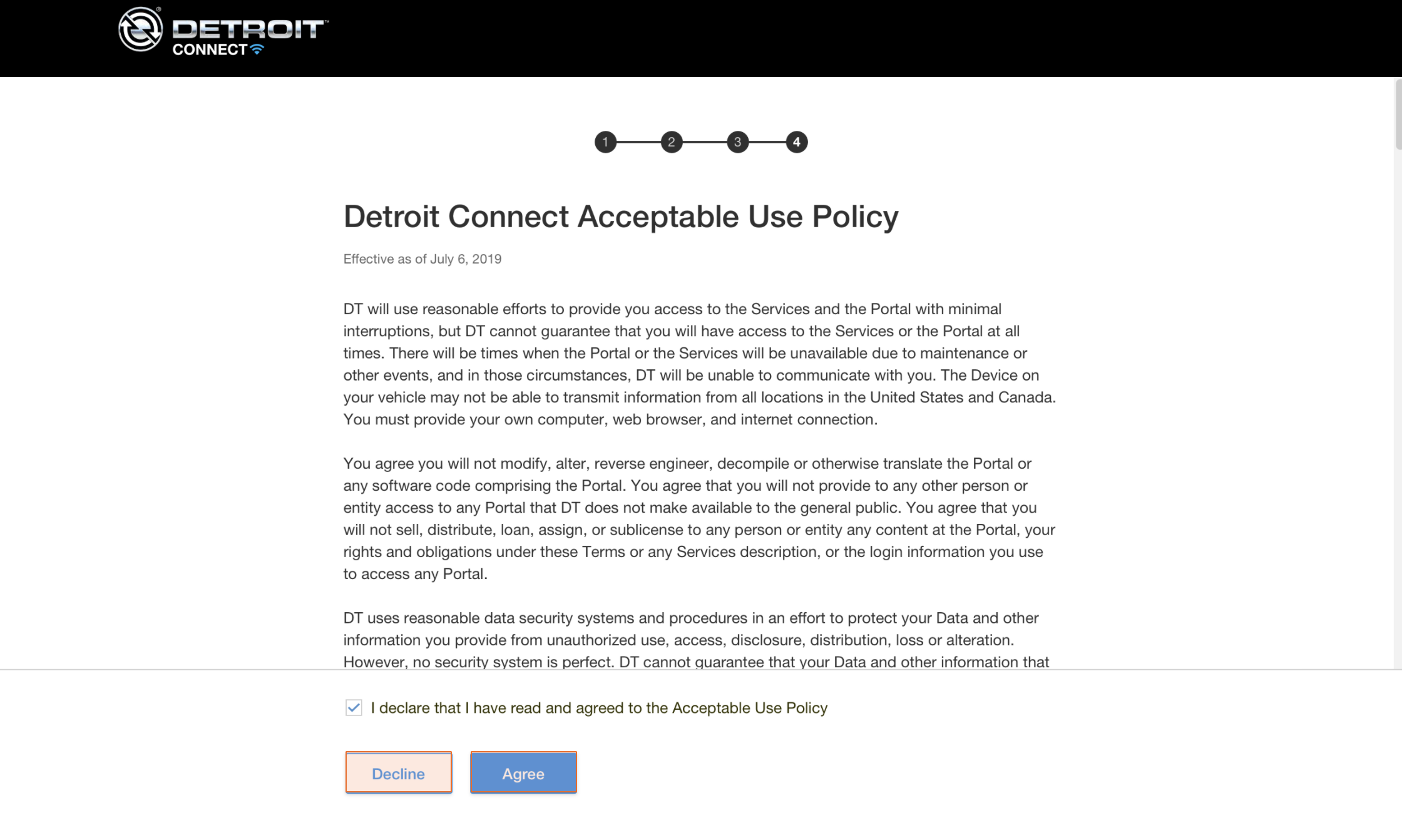
Step 6: Accept policy
User agrees to the acceptable use policy, after which, they’re in. Easy peasy.
DCP Refinements
During my time at Daimler Trucks, I made many valuable improvements to the online dashboard. A few of them are displayed here.
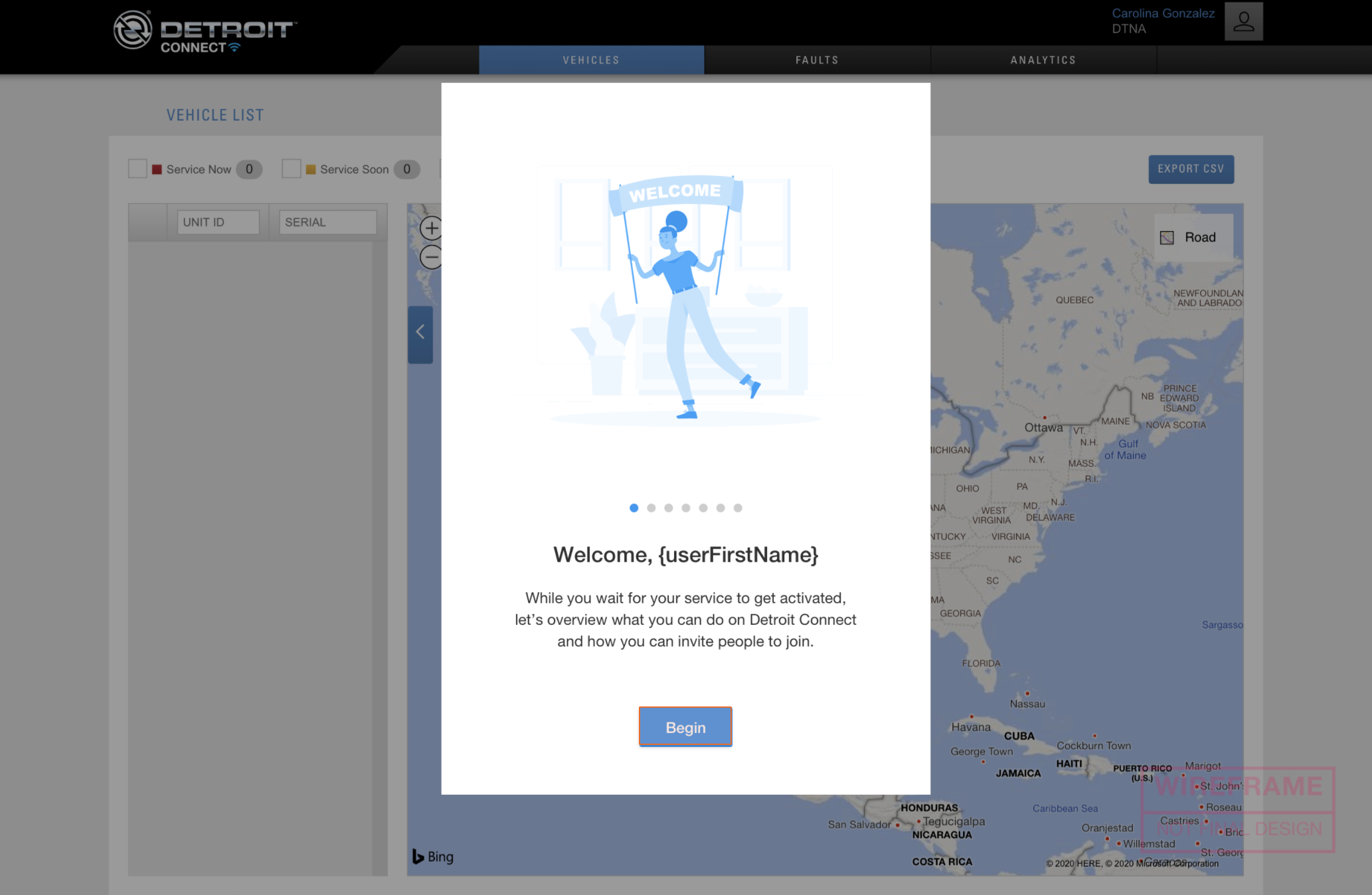
Welcome screen
Upon enrolling to DCP, users were given an initial dashboard and they were expected to know how to navigate the system automatically. This welcome screen eliminates confusion by providing a friendly introduction that guides the user.
View Mockup
Login screen variations
I mocked up a variety of methods to display crucial information for users before they log in. We reviewed and discussed them as a team and collaborated to make the final decsision.
View Mockup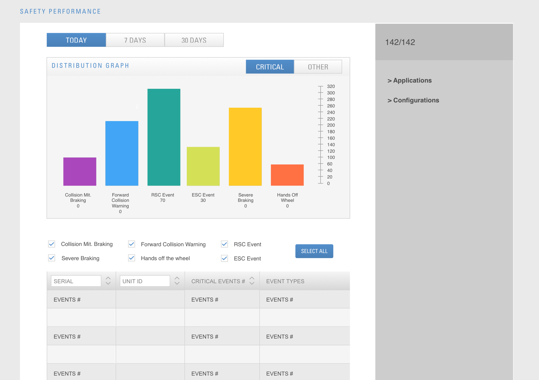
Safety Performance
The previous Safety Performance page was boring and there was no way to differentiate between the columns because they were all the same color. Daimler’s average users consist of older folks that have simple requirements: easy assimilation of data. I included filters and checkboxes to sort data.
View MockupNew Filtering Proposal
An overwhleming amount of data can lead to quick confusion. If a customer has hundreds of trucks, finding one quickly can sometimes not be an easy task. Users needed a way to filter fault lists to find the vehicle with a problem to resolve it fast. Additionally, I gave users the option to mark a fault as resolved and download a CSV of the list. For inspiration, I looked to Airbnb, Yelp, Google Hotels and Jira to find examples of current filtering methods.
VIEW MOCKUP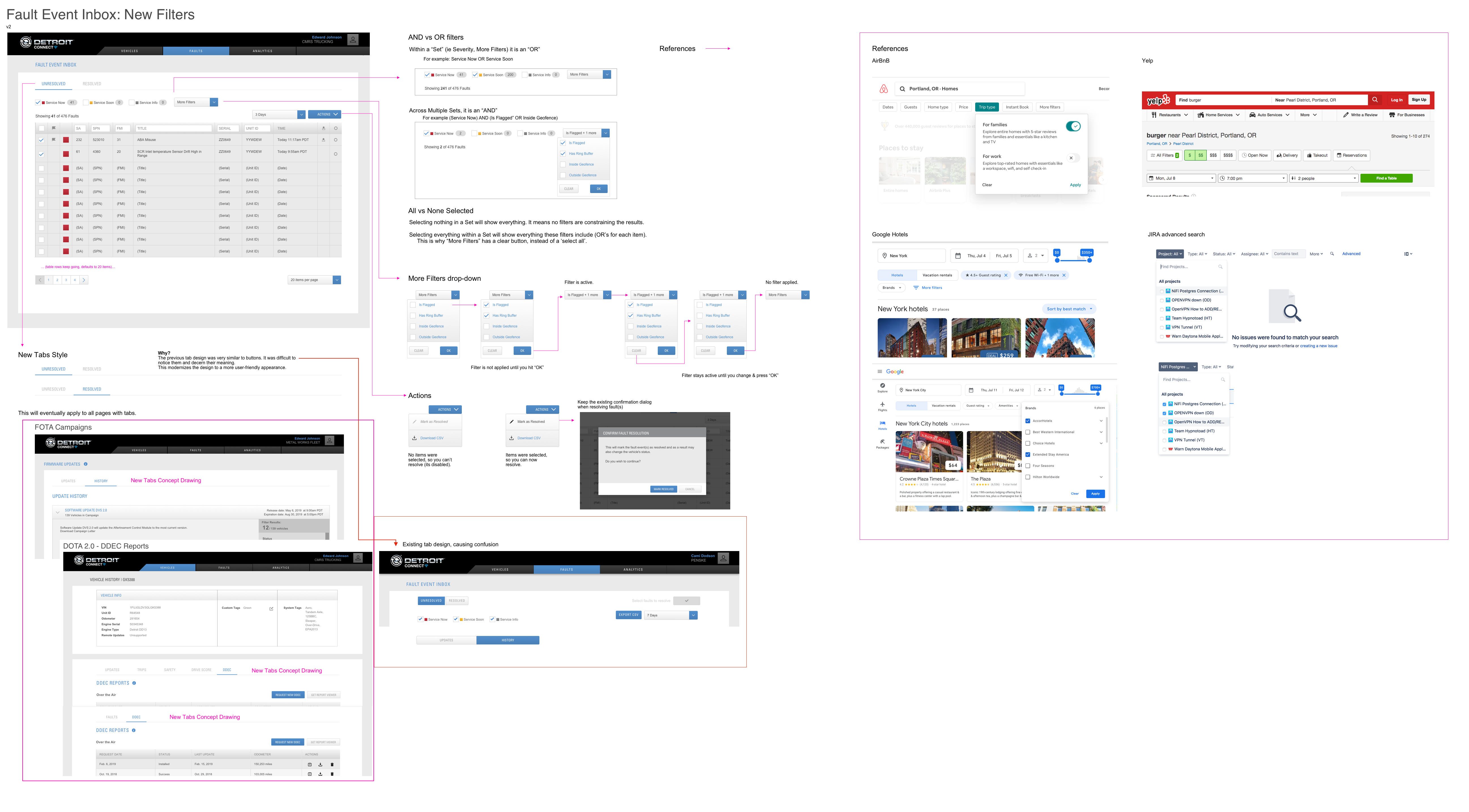
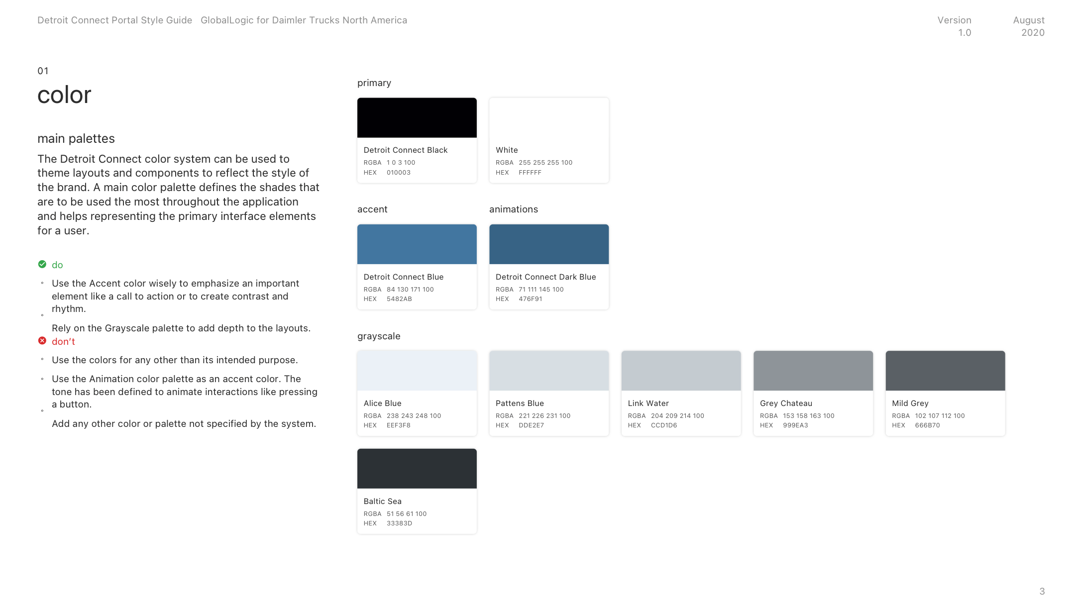
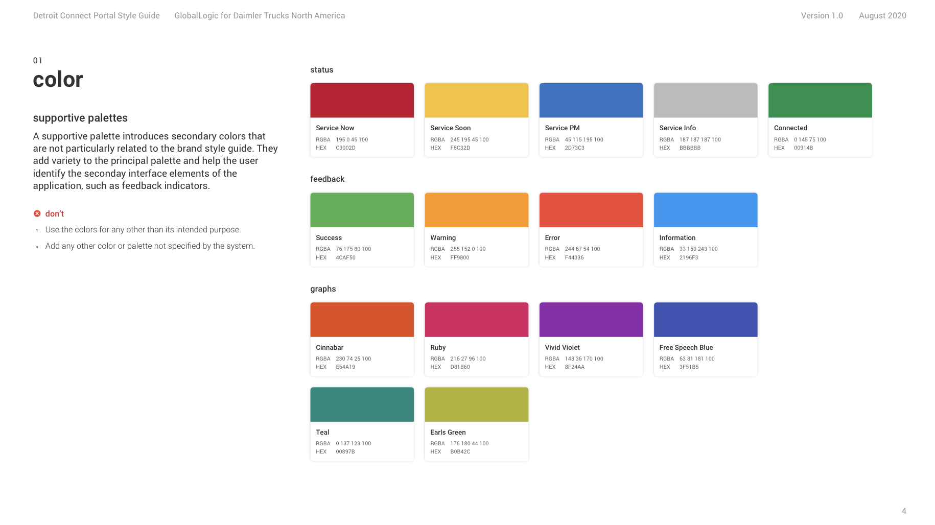
DCP Style Guide
A portable portfolio
To learn more about the additional research, interaction design and visual design I accomplished at Daimler and Intel, click the button below to review the presentation.
OPEN PDFINTEL CORPORATION
Data-driven
After graduating from the Art Institute of Portland, I started as a contractor at Intel on April 16, 2012. On Monday Jun 24 2013, I became an full time, permanent employee. It was one of the best experiences of my life. I got a crash course in UX and the corporate environment. I quickly learned that data is what drives business at Intel.
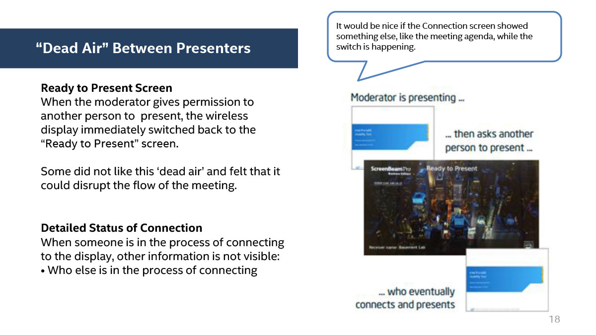
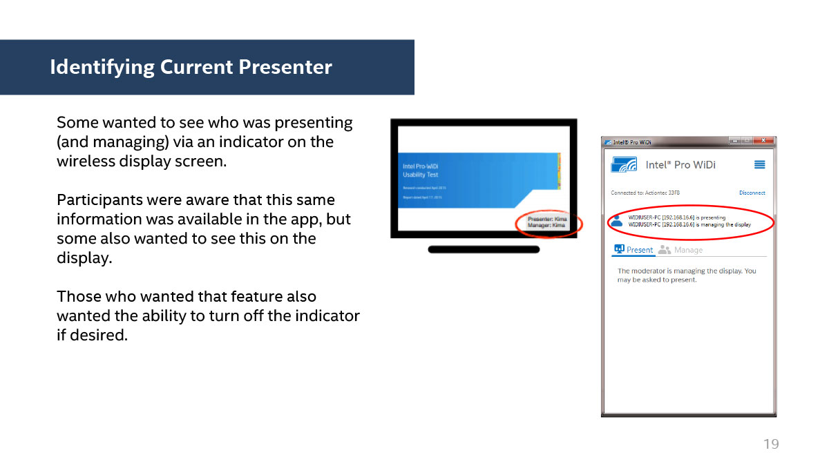
WIRELESS DISPLAY
The project I’m most proud of is Wireless Display. It was a way to duplicate or extend a laptop screen to a large mon. I was the visual/interaction lead.
GAMING
I’ve been a gamer since the 80’s, so this subject is close to my heart. I loved everything about this project and had the most fun working on it.
WIRELESS DOCKING
The docking team reached out and requested my help with the dock’s UI and external visuals. It ended up winning a Silver A’ Design Award in 2016.
802.11AC
I assisted an internal Intel team with an animation that explained how 802.11ac wireless technology functions. The video was put on display at a large trade show.
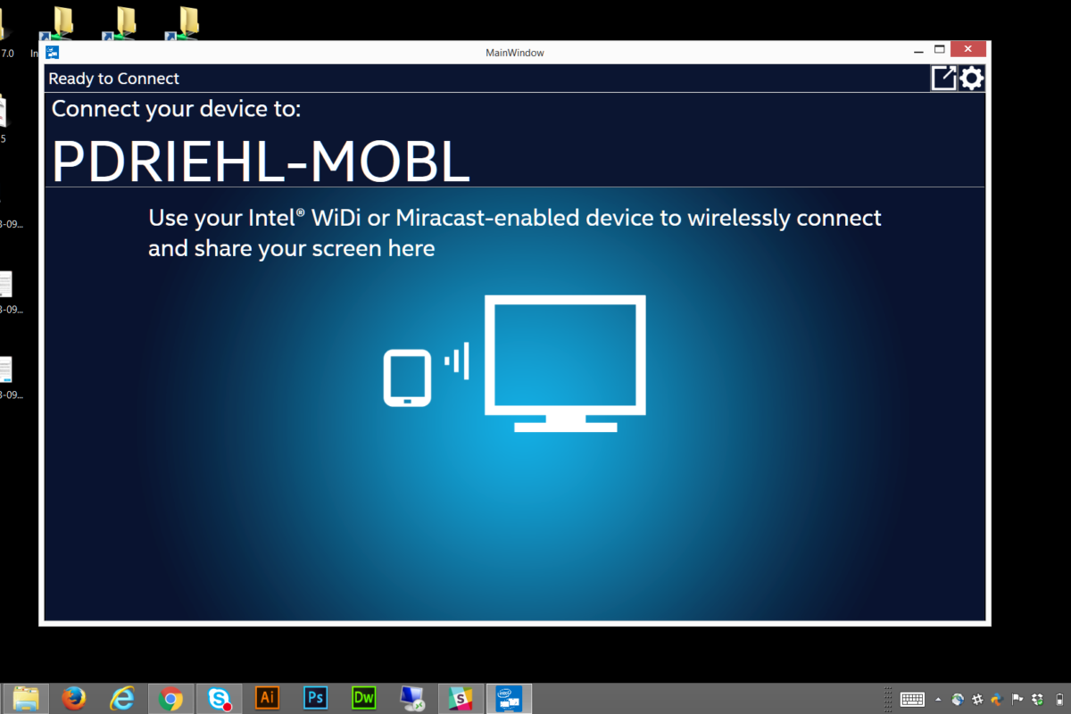
Intel’s Wireless Display
Intel’s bread and butter are the chips they manufacture. The more consumers buy computers, the more Intel can sell chips. So, why not drive the core competencies that sell computers? In 2013, Intel heavily invested in the wireless space: display, docking, and charging. I was the lead visual and interaction designer for Wireless Display (WiDi).

How it works
This short promotional video demonstrates the connection process of Intel’s Wireless Display and BizStik wireless adapter. Folks often have difficulty presenting to a larger screen and Intel’s products solve those problems. I created all the images on the screens in this video and edited the scenes + included the background track. It was a fun project and I learned a lot.
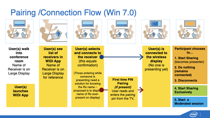
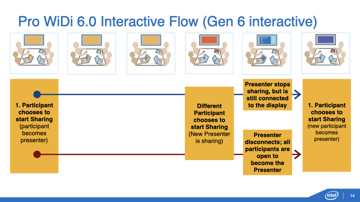
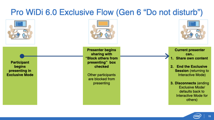
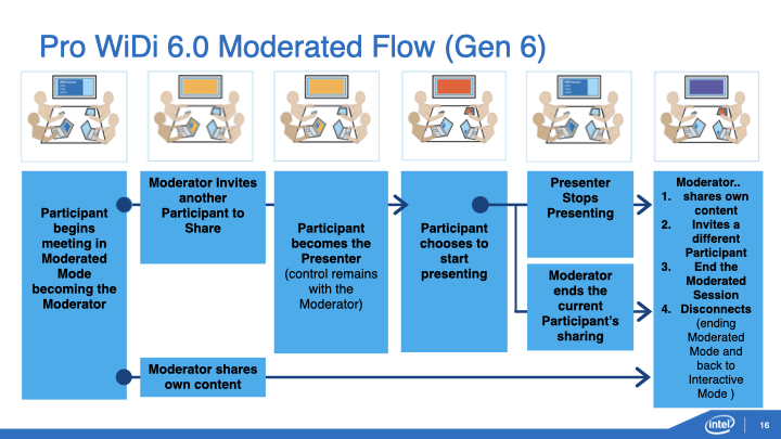
VIEW VIDEOWiDi Flows
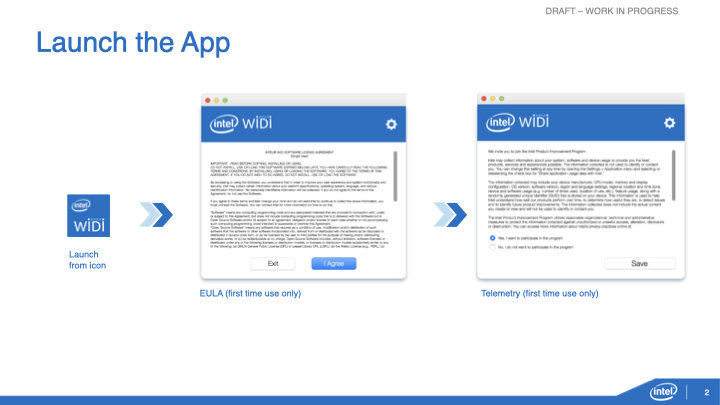
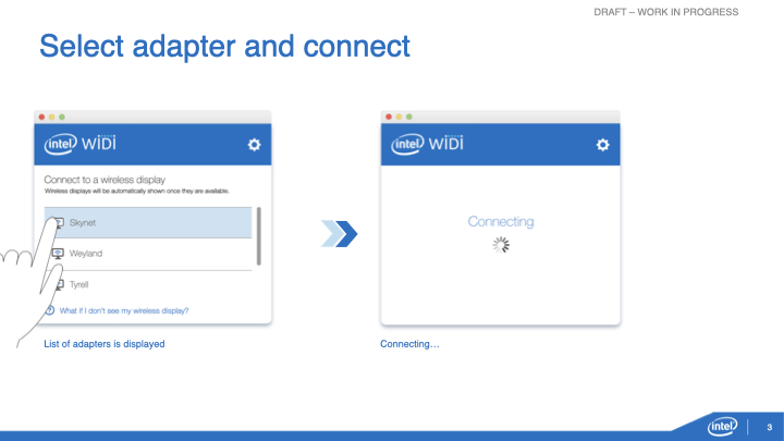
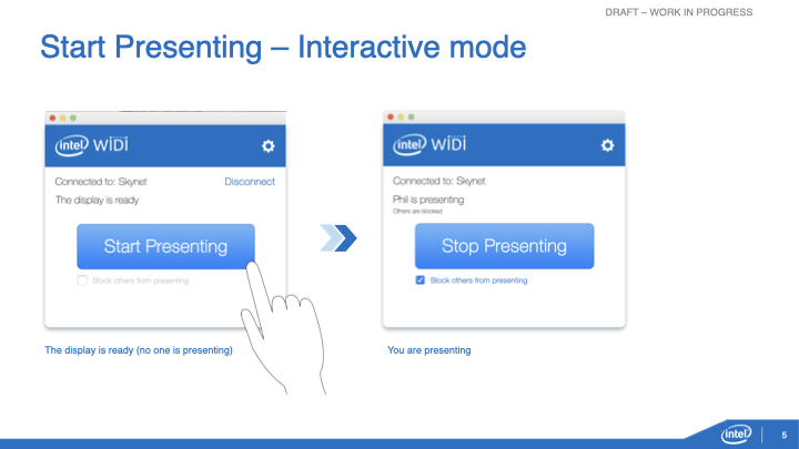
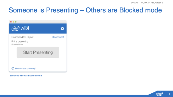
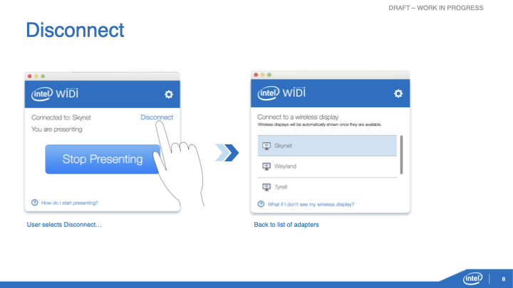
These flows were created to explain how users connect using WiDi from launching the app to a possible moderated session.
Where WiDi started
When I joined, the project was in flight. It was originally baked into Windows OS, but my team created a stand alone app for it. Here’s what it looked like in the early stages:
WiDi’s value significantly increased after my small team and I put a lot of time and effort into it. With its enhanced functionality, it became a major contender in the wireless sharing space.
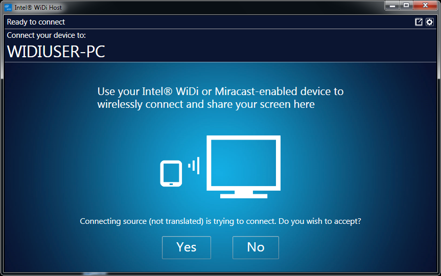
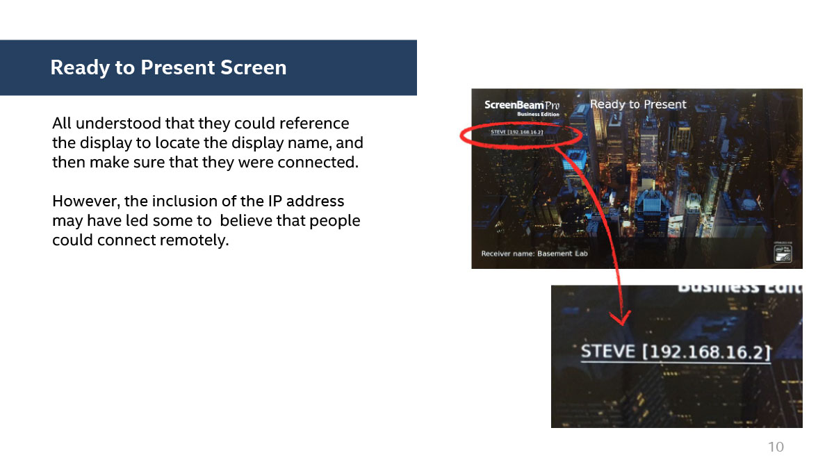
Initial connection screen
Intel requires all applications to contain the appropriate branding, and the clear call to action directs the user quickly and easily. Directions were the most important part of setup, as some folks were easily confused.
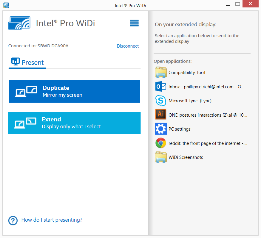
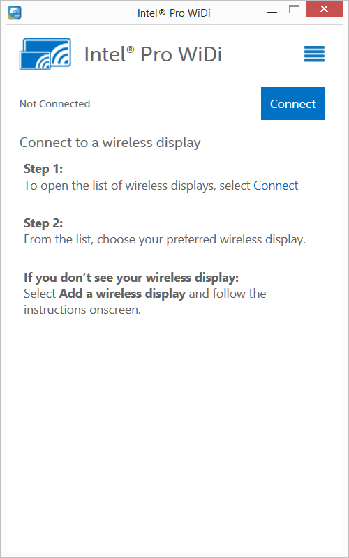
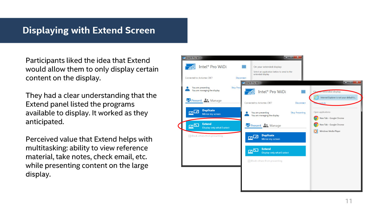
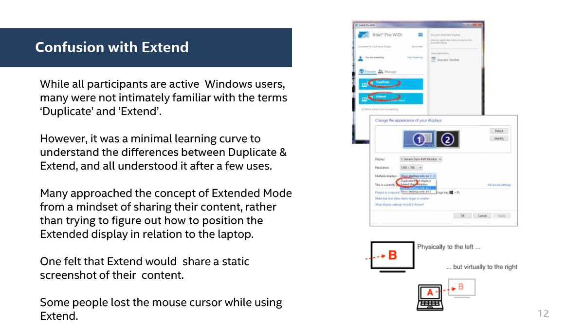
Upgraded design and functionality
We gave users the option to duplicate or extend their screen, while showing them all their open applications, making it easy to decide which specific screen to display. Interesting how Zoom and WebEx do that now.
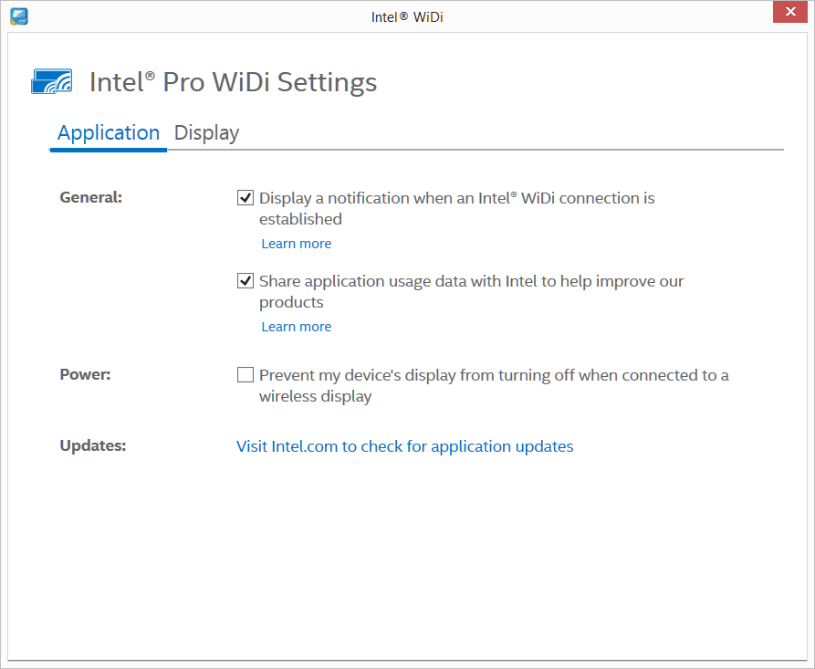
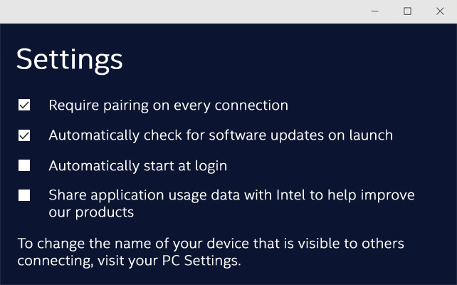
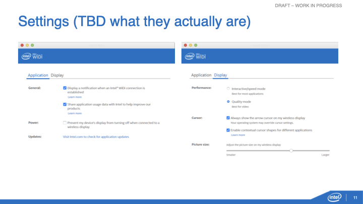
Settings
Displaying the settings from the hamburger menu helps the user customize the experience and update when necessary.
WiDi Mac App Flow
Historically, Intel has always developed applications for Windows. In fact, it was difficult for employees to obtain Apple computers and find support for them. My UX team used Macs back in 2013, so we decided to develop a Mac version of WiDi, which was ground breaking for Intel. My role was visual design lead with heavy interaction design influence.
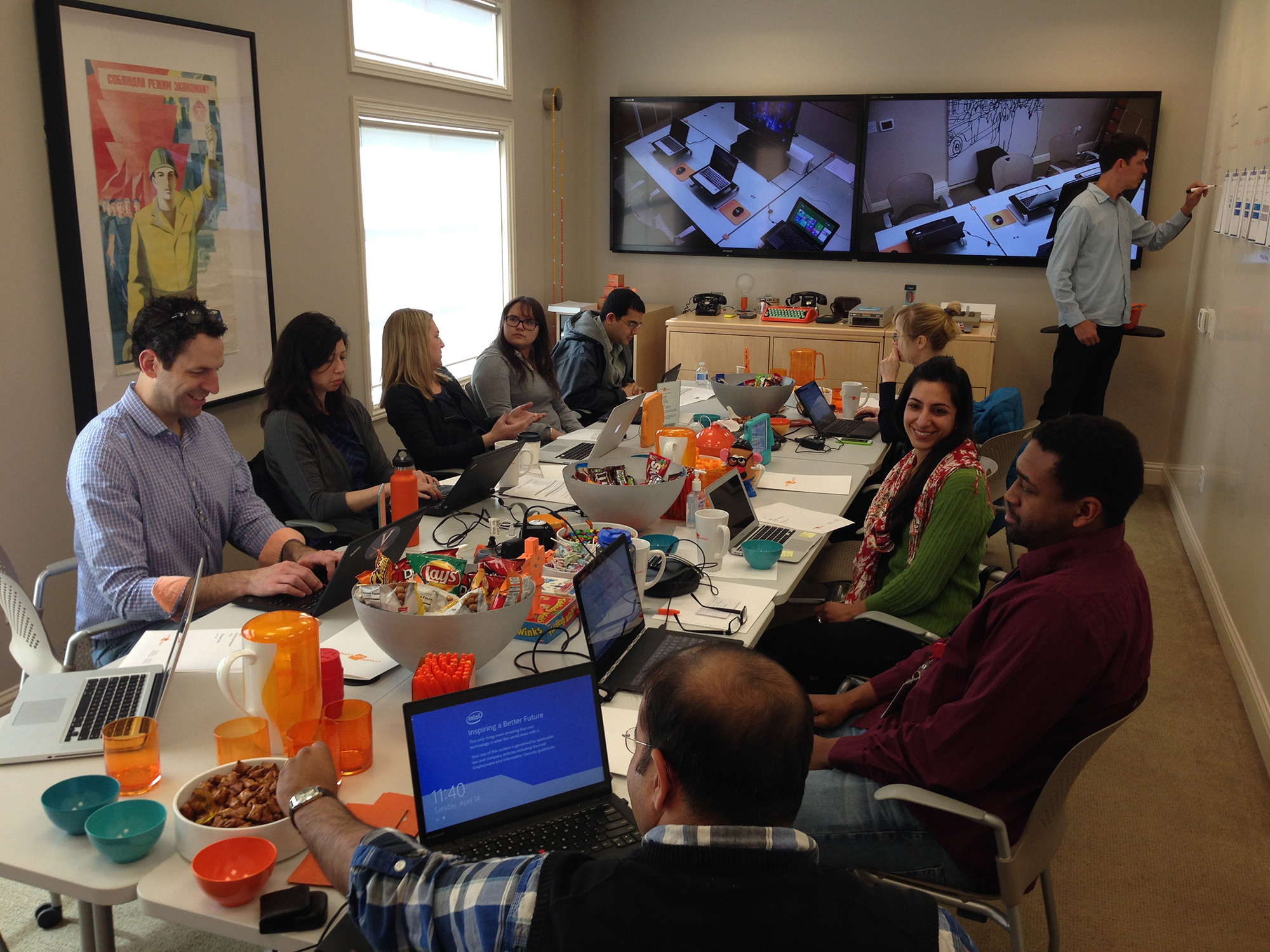
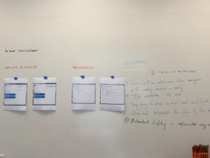
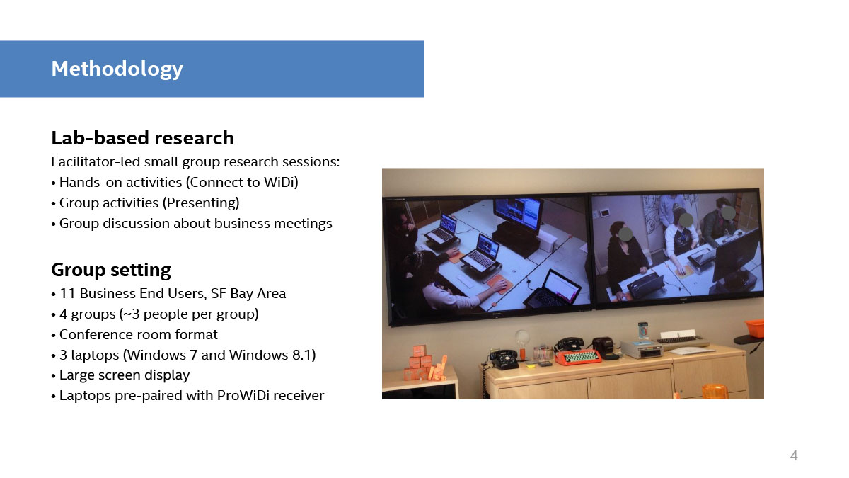
User Testing
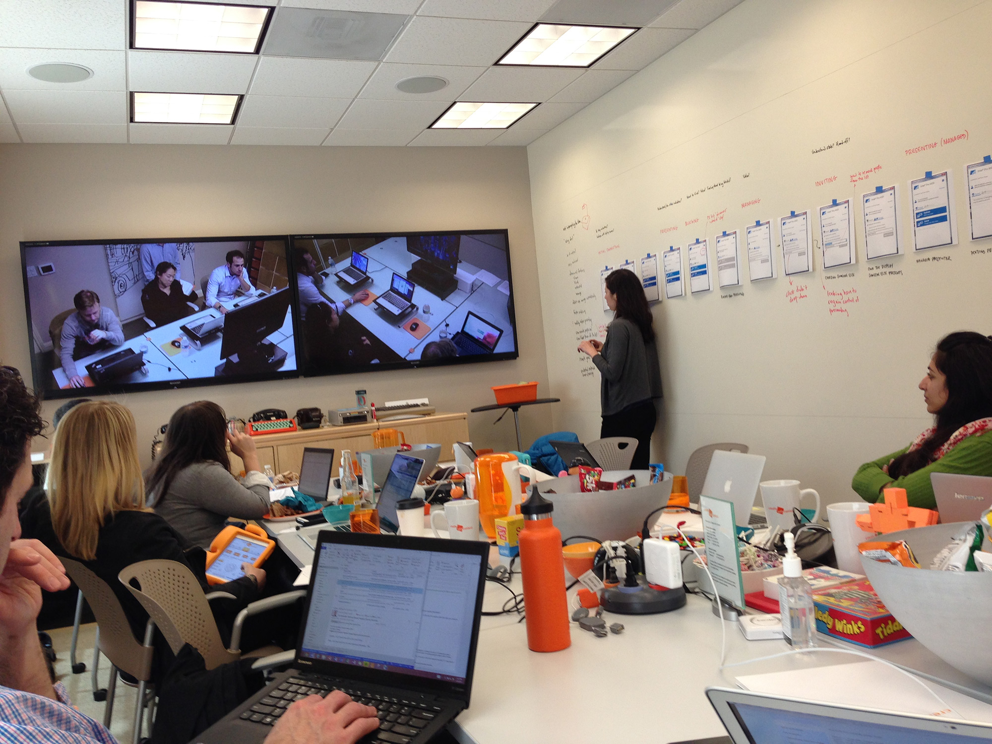
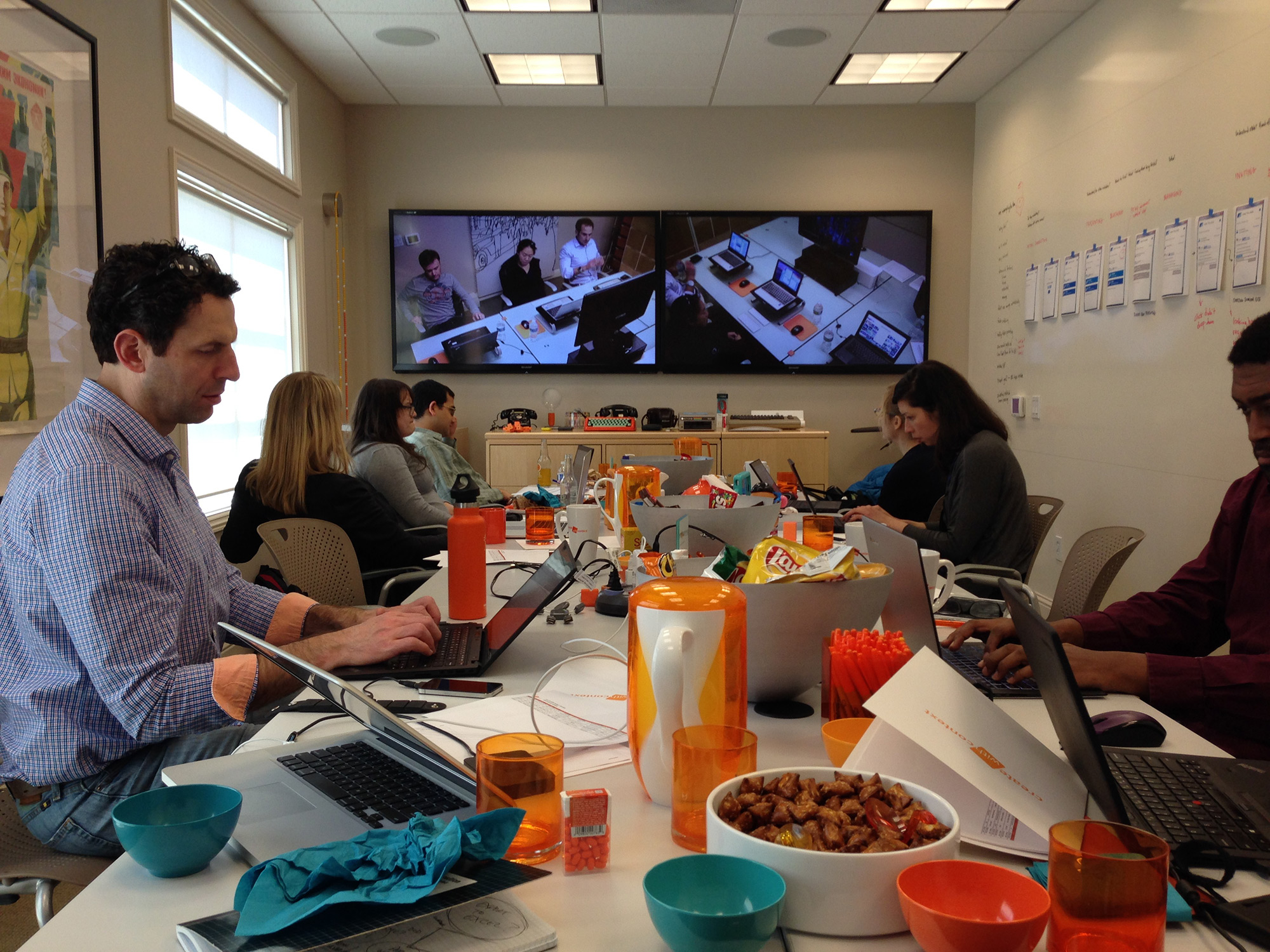
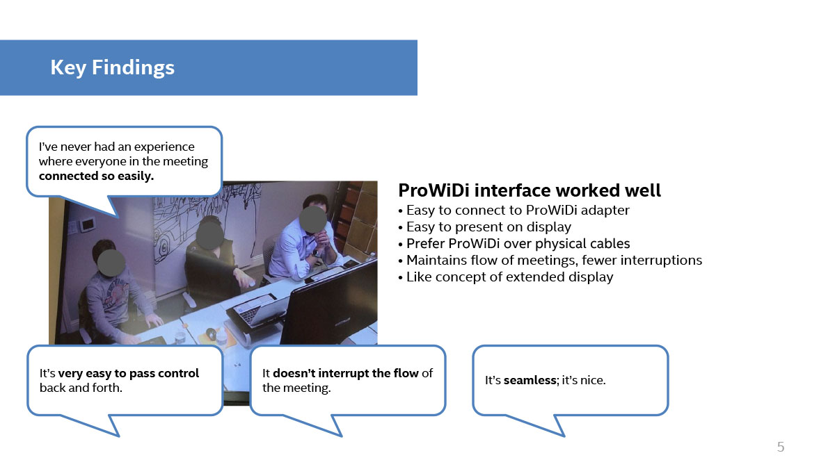
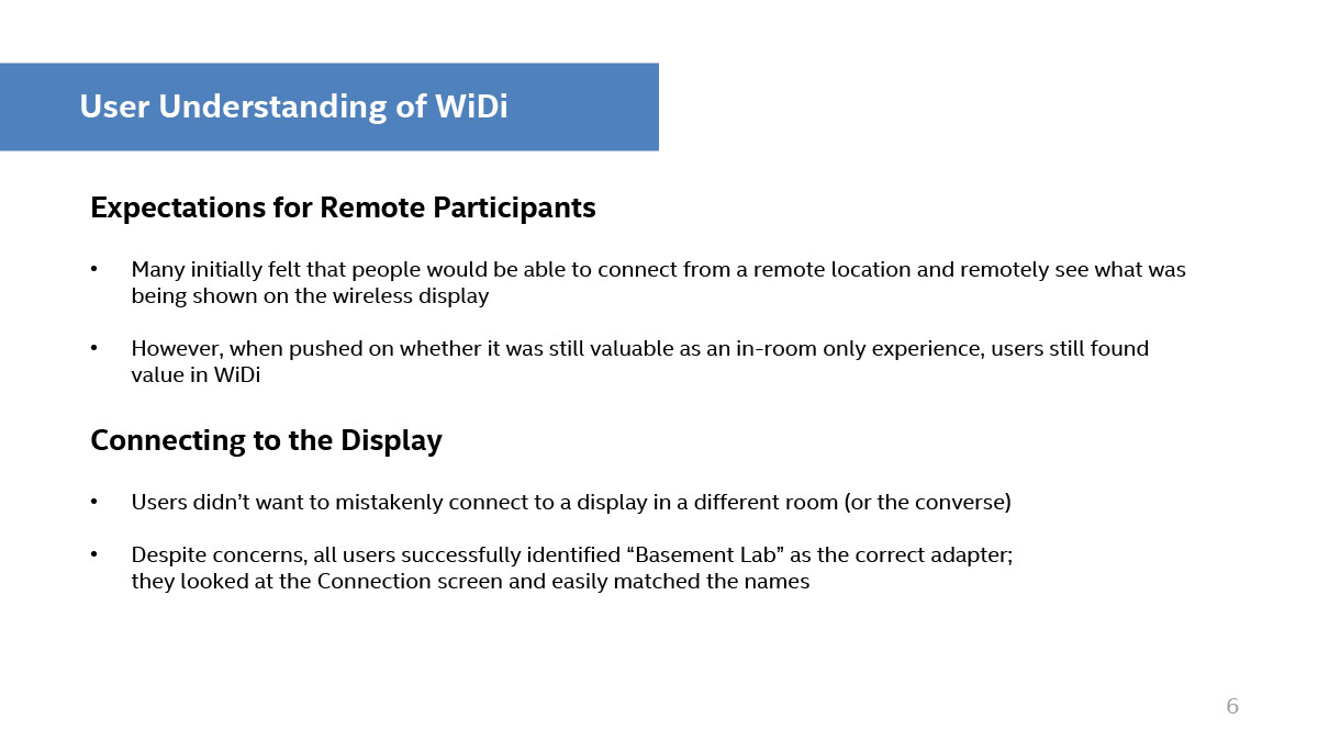
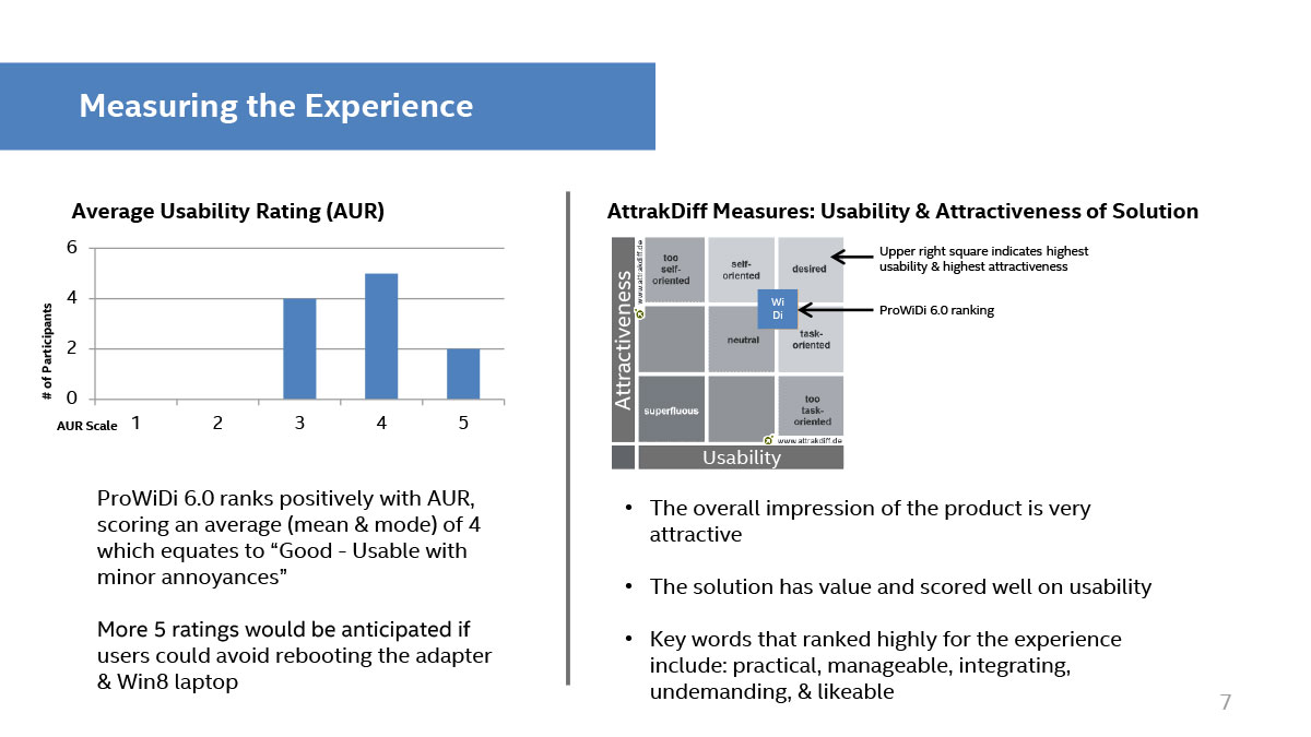
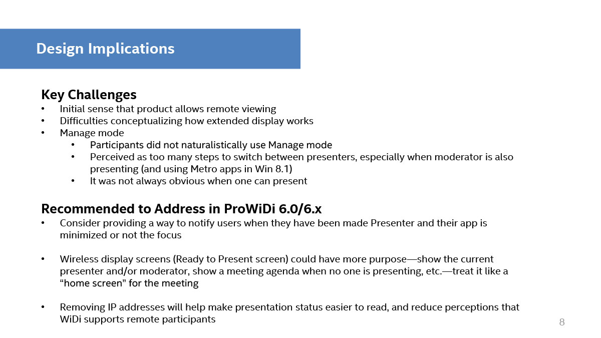
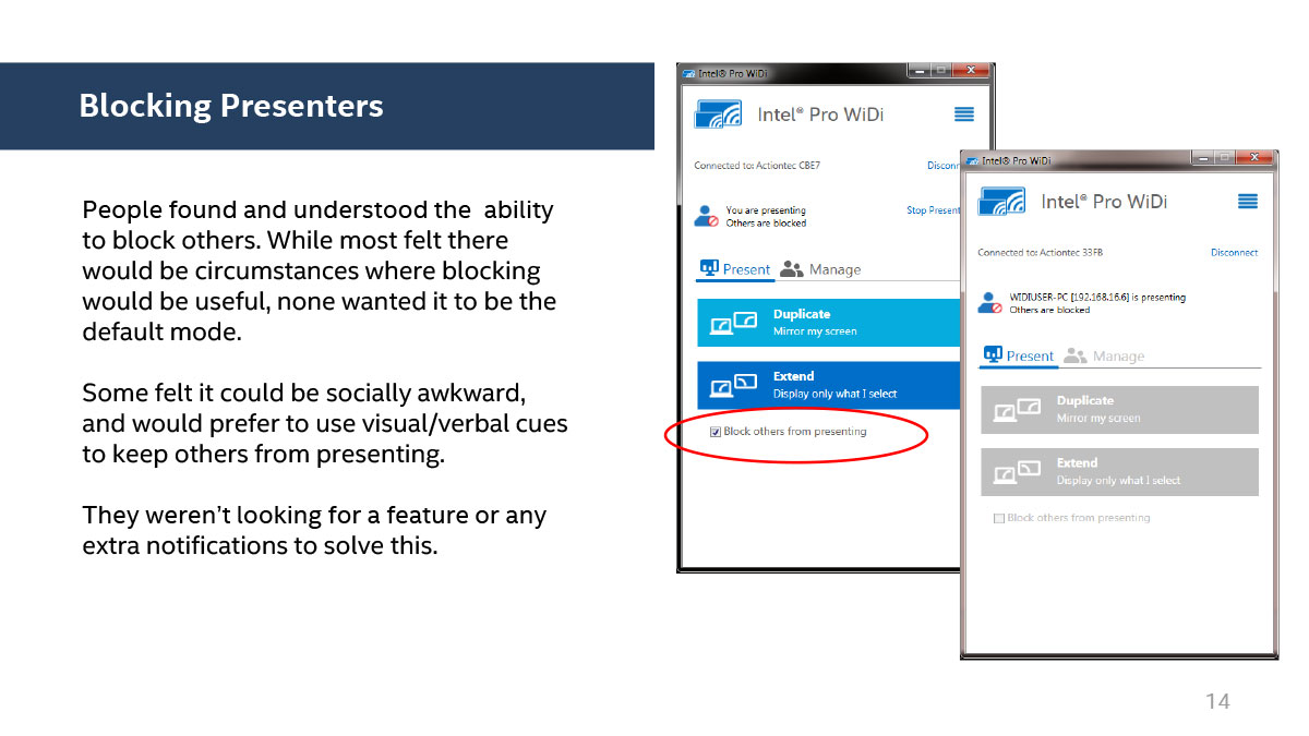
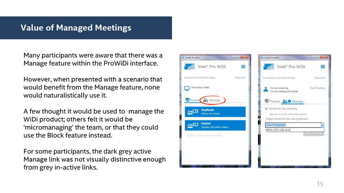
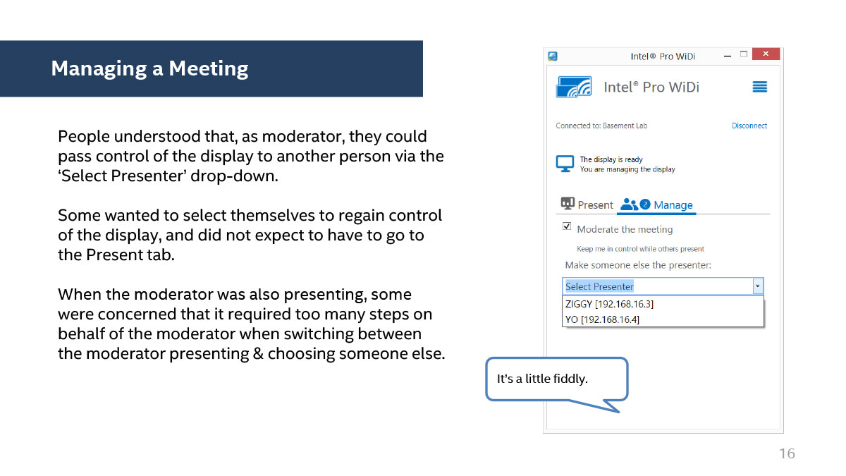
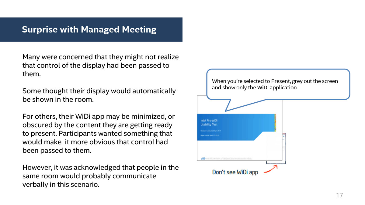
Intel hired independent bay area research company Create with Context to conduct user testing on Wireless Display. We gained some fabulous insights and presented all qualitative and quantitative data to management, who prioritized specific goals moving forward.-
- Starting user testing

-

- Full team monitoring user testing
-
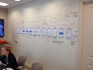
- Notes on the interaction flow


-
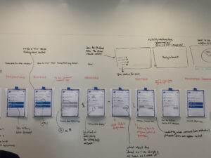
- Interaction flow #2
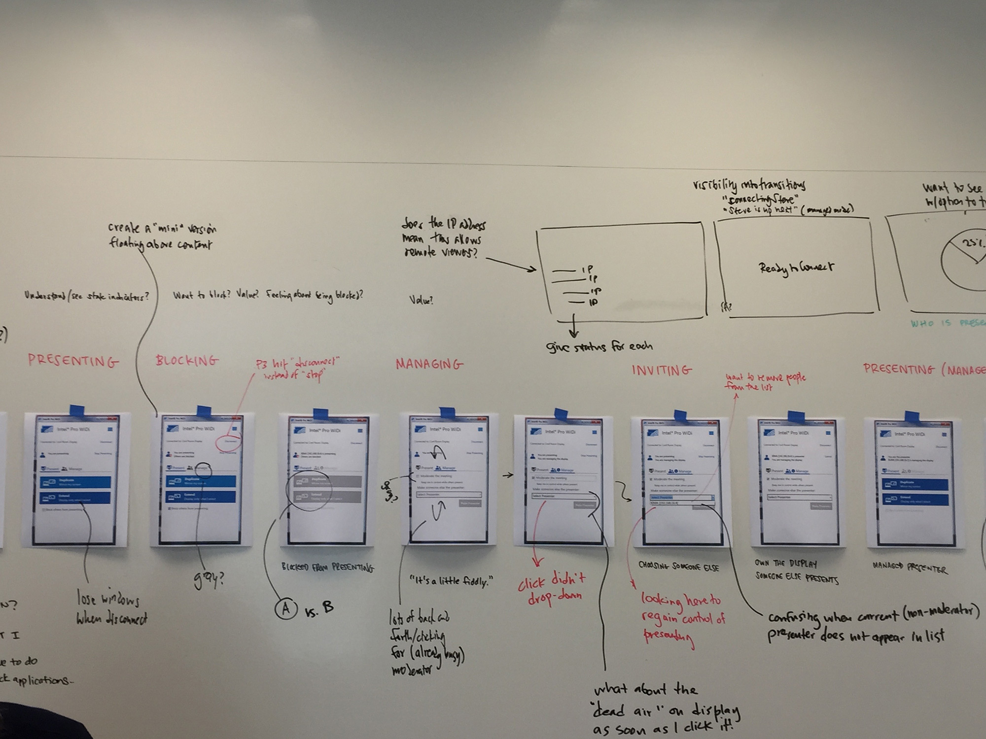
-
- Interaction flow #3

Usability Study Report
The report which was delivered to leadership thoroughly explored all aspects of our test so we could determine our strategy moving forward.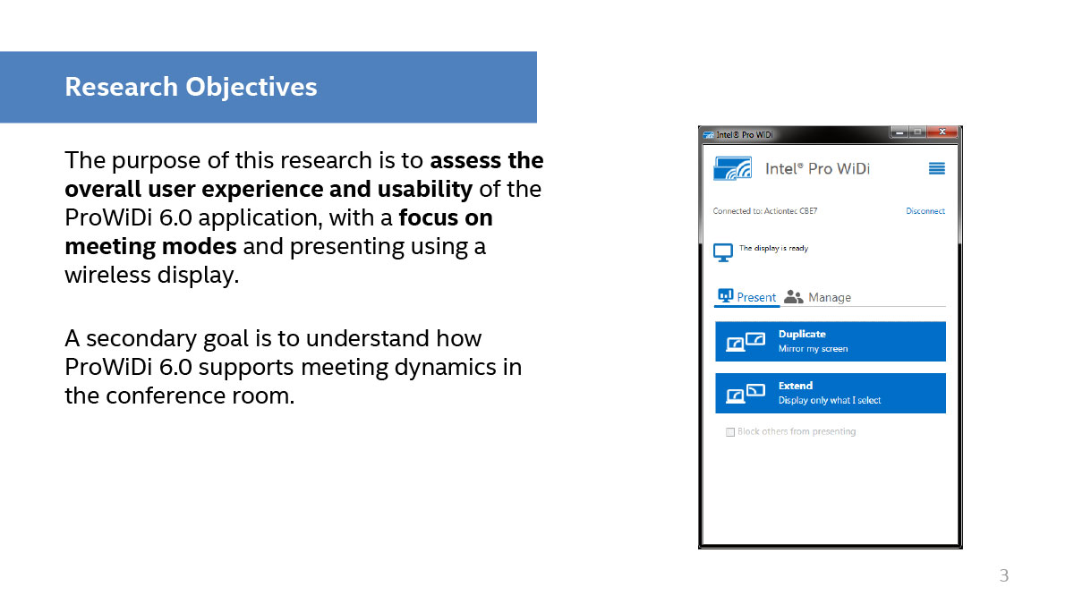
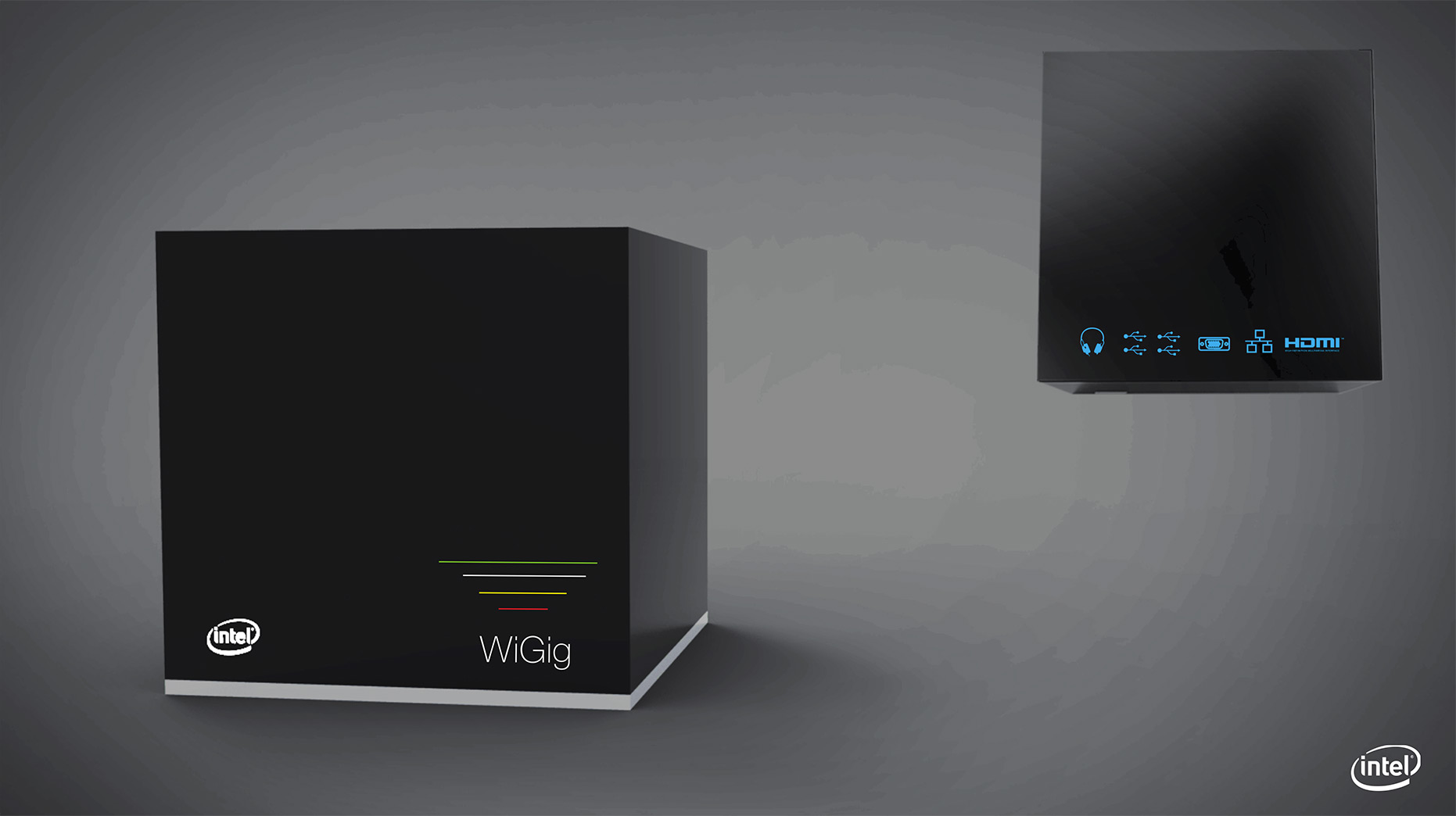
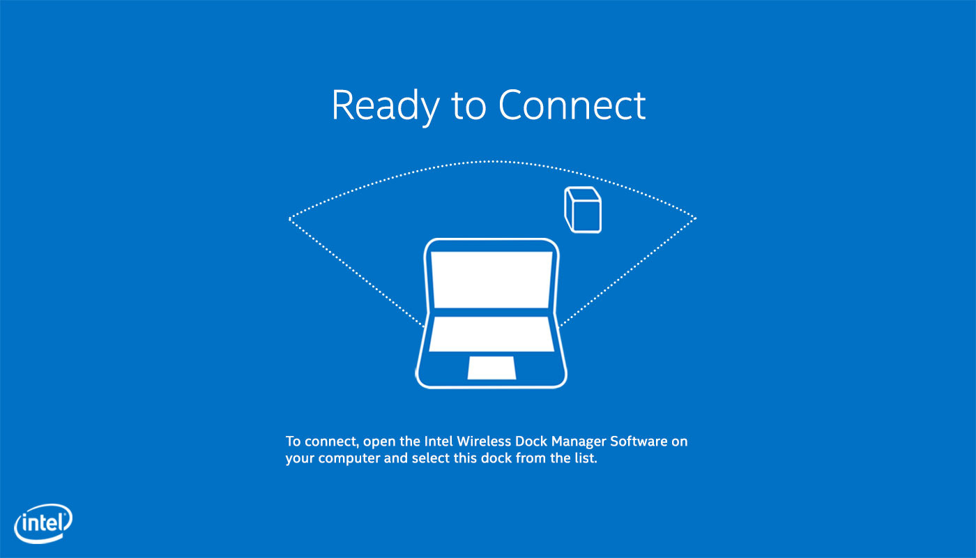
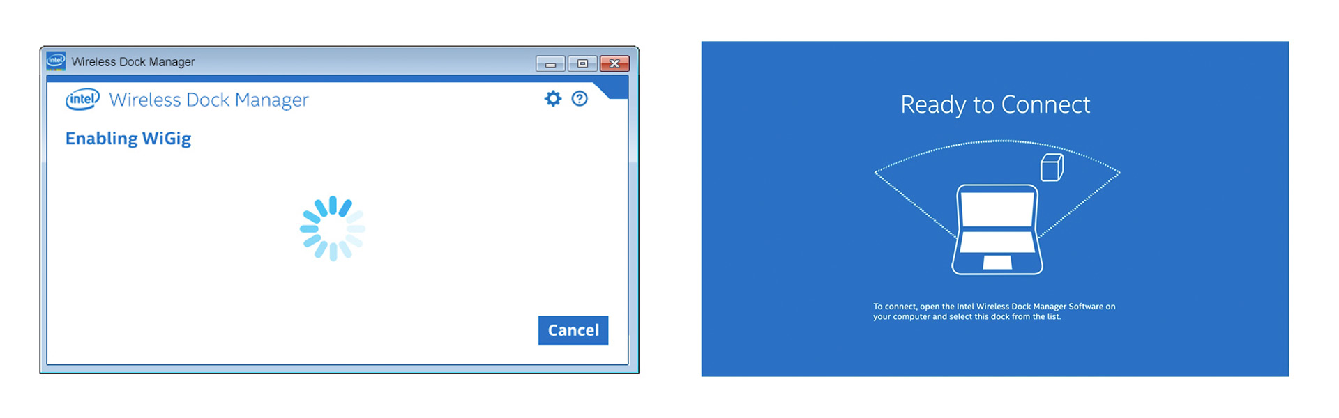
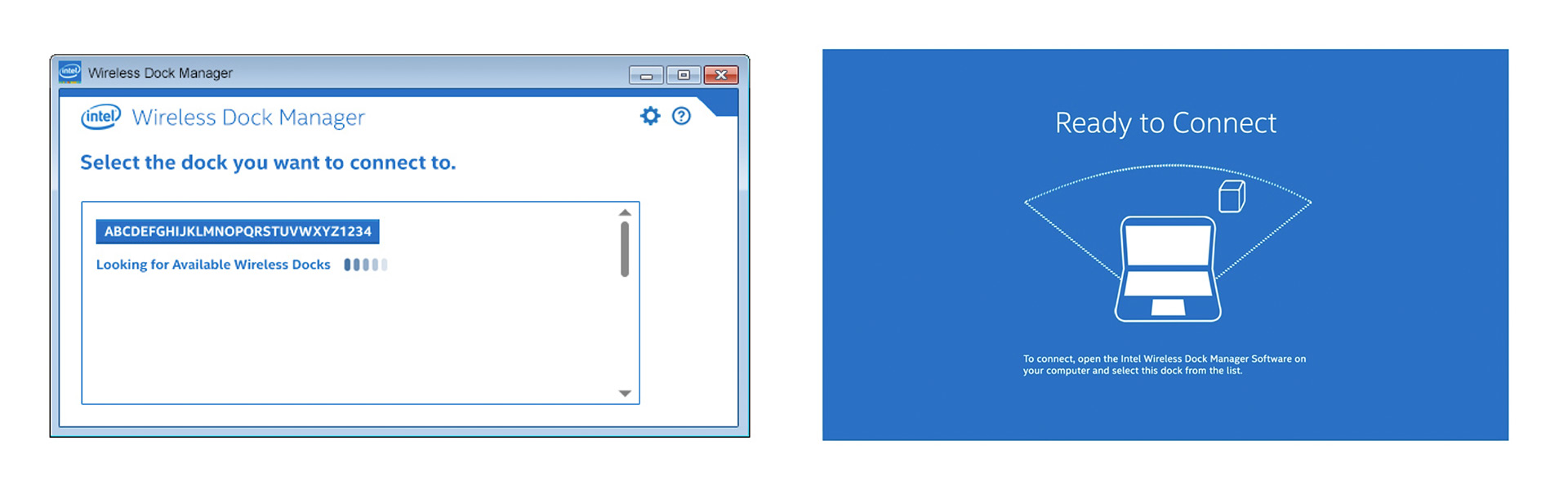
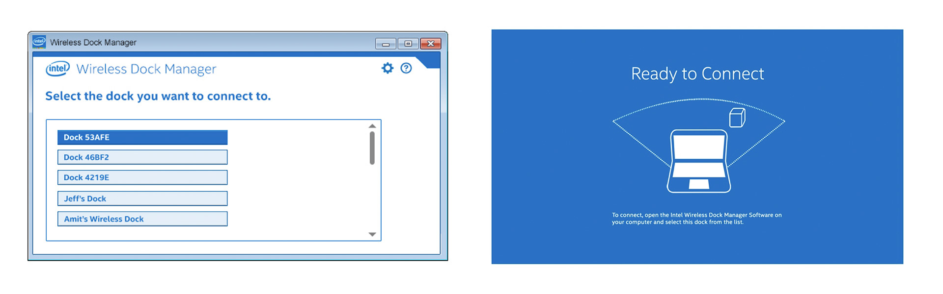
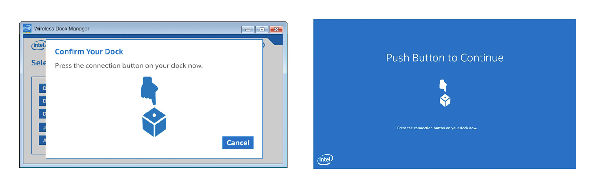
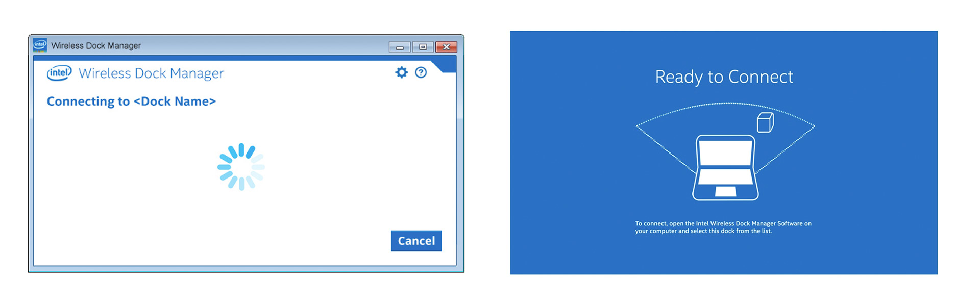
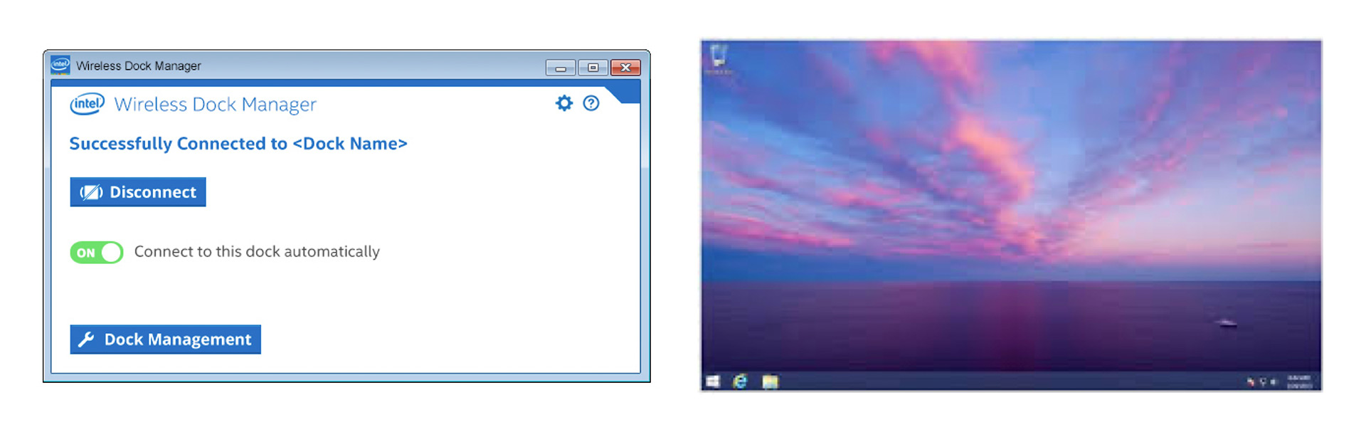
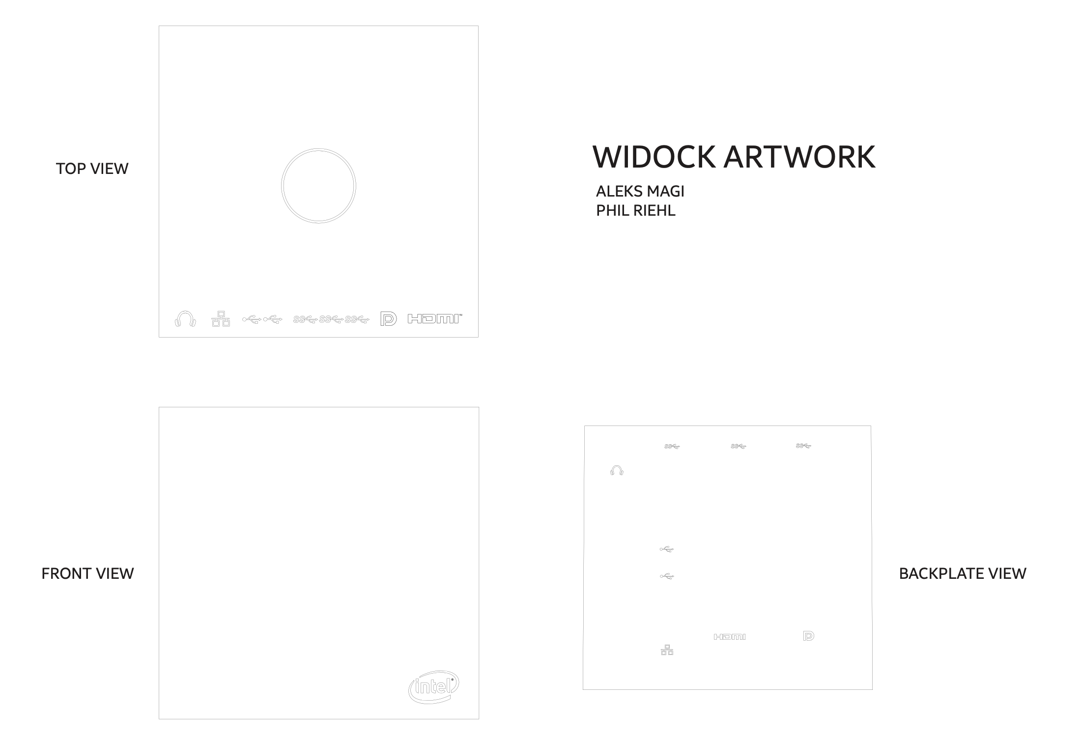
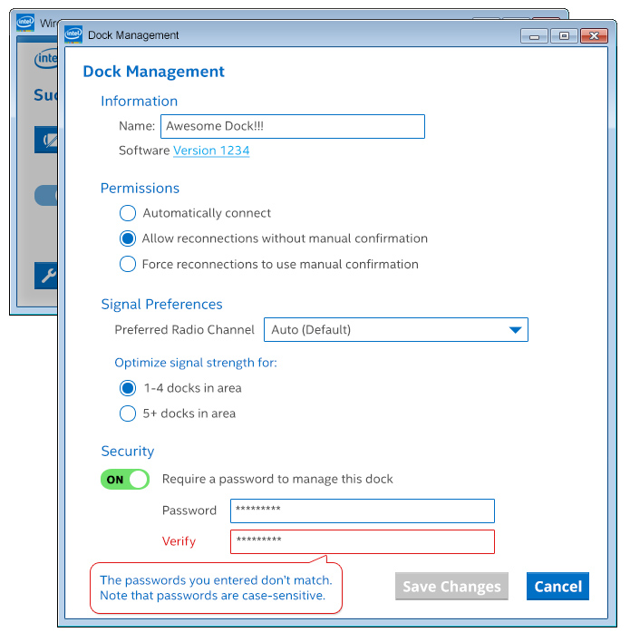
INTEL WIRELESS DOCK
There when you need it, gone when you don’t
The WiDock team asked me to work on the visuals and interactions of the UI, on-screen display, icons, and exterior industrial design graphics. It was quite an undertaking, but rewarding and fun. The WiDock won a Silver award from the Industrial Designers Society of America.
WiDock IDSA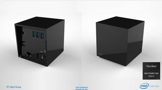
WiDock Flow
The dock is plugged into a monitor and other devices like printers, external drives and audio devices. When a laptop is near the dock, it connects wirelessly without the need for dongles or a docking station. The app would be downloaded and installed on the laptop, which are the screens on the left. The on screen display on the right would show on an external monitor.
The flow below gives the user directions on the laptop (left) and corresponding visuals on the monitor (right). I designed all the screens shown here.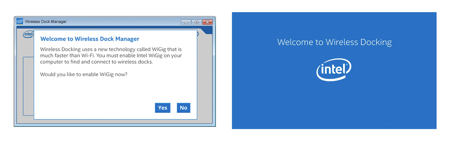
WIDOCK
Graphics Galore
I had never created graphics for industrial designs before, but I’m proud of the work I’ve done here, including iconographic variations, and additional settings screens for such an innovative product in 2014.
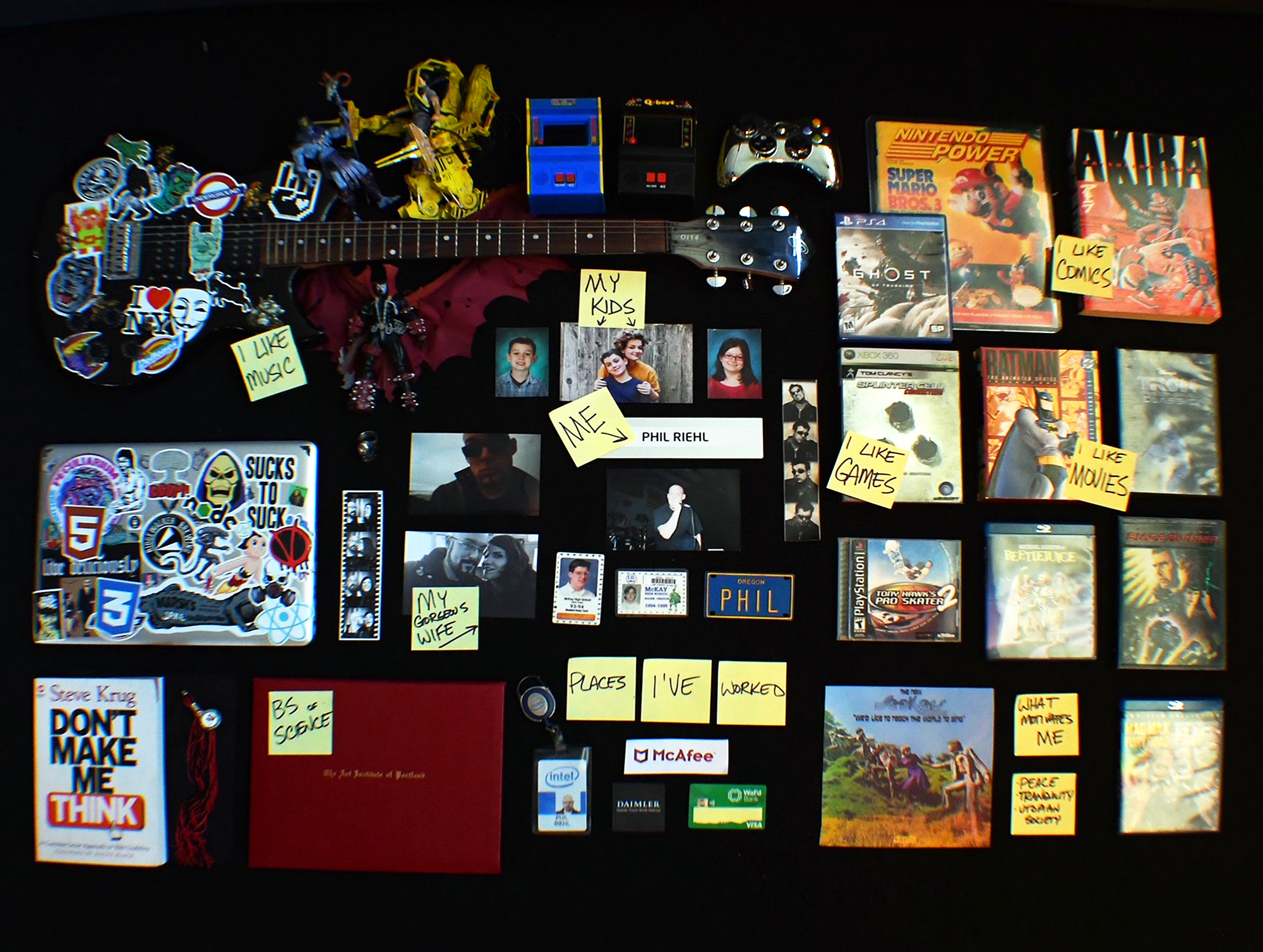
A little about me
My pronouns are he/him, I’m a happily married man and father of 2, lived in Oregon since 1986 and enjoy music, movies and video games.
I like pop culture art and collectibles because they remind me of days past. My favorite movie is Blade Runner.CONTINUOUS DISCOVERY HABITS
Currently reading
This book emphasizes the need for continuous discovery as a way to validate assumptions and build successful products. It encourages teams to engage in ongoing learning and exploration to better understand customer needs.
DISCOVERY MINDSET
Adopt a discovery mindset. Embrace uncertainty and focus on learning rather than solely on delivering features. Practice curiosity, empathy, and open-mindedness.
DISCOVERY HABITS
Regularly engage with customers, conduct frequent experiments, analyze data, and collaborate closely with cross-functional teams. Make discovery a part of daily work routines.
DISCOVERY SKILLS
Customer interviewing, problem framing, and hypothesis-driven experiments are practical techniques and frameworks to help teams improve their discovery skills.
ORG ALIGNMENT
Aligning discovery org goals can be a challenge, but we can build strategies for alignment, fostering a culture of experimentation, and integrating discovery into existing product development processes
Testimonials
Many of my teammates have great things to say about working with me. Here are a few of them.
“Phil is both an outstanding employee and collaborator. He thinks through the problem before he puts pen to paper, but more importantly, is able to explain to stakeholders the decisions he is making.”

Rick Ebert
CHARLES SCHWAB
” As the user experience design lead for WaFd Bank’s new online banking platform, Phil demonstrated a strong foundation in UX design principles, communication and knowledge. Phil really integrated with the team members, developers and leadership. He led user interviews that resulted in numerous product improvements. WaFd Bank has significantly grown in branches and revenue and I attribute much of that to successes in the digital space. I highly recommend Phil as knowledgeable, talented, and a great guy to work with.”

Jordan Douglas
WaFd
“Phil constantly seeks out new opportunities to learn, whether it be prototyping software, getting his hands dirty in web code, figuring out more effective ways to work with developers, or how to address challenges on our team – he does not shy away from any challenge.”

Laura Thelen
Intel
Let’s talk
I’m always open to a conversation. Can we work together? Let’s find out.