WORLD-RENOWNED CYBERSECURITY
Developing digital security tools for PC’s, servers and mobile devices
While it was named Intel Security, I joined the company in 2016, as a UX designer within a marketing team. My primary goal was to promote the sale and recurring subscription of LiveSafe and other McAfee products. Additionally, I assisted with McAfee’s shopping cart experience.
In 2016, one of McAfee’s go to market teams was tasked with a new campaign that appealed to different types of personas. In partnering with 3rd party agency Razorfish, my team was able to create 3 seperate methods of communicating similar content in order to conduct A/B/C tests with customers to understand which method resonated the most. I created visual assets for emails, responsive landing pages, and toast notifications, coding them in HTML & CSS, and embedding them in the product which encouraged users to subscribe annually.


Alerts and Notifications
These unobtrusive window elements (toast notes) explain the general value of the application, inform the user of the amount of time left in the 30 day trial, and provide the opportunity to purchase and subscribe to LiveSafe.
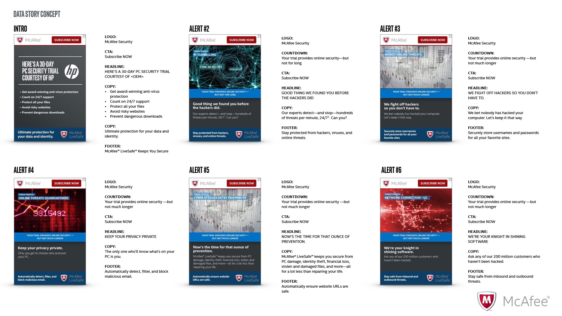

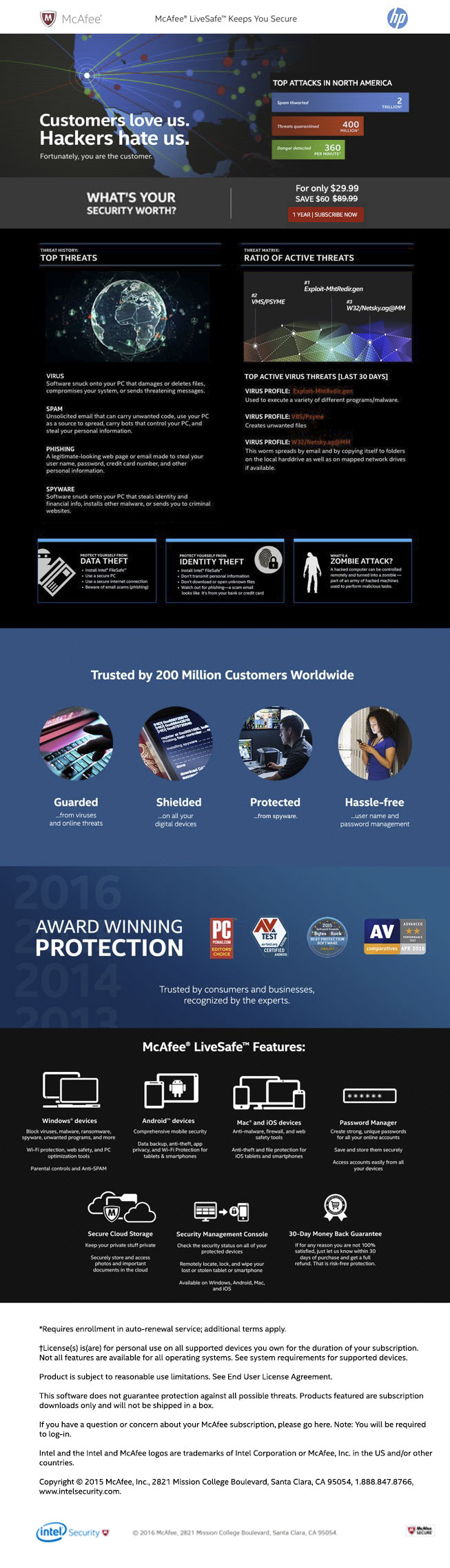
Data
The data concept uses quantitative metrics to entice users to purchase and subscribe.
VIEW DETAIL

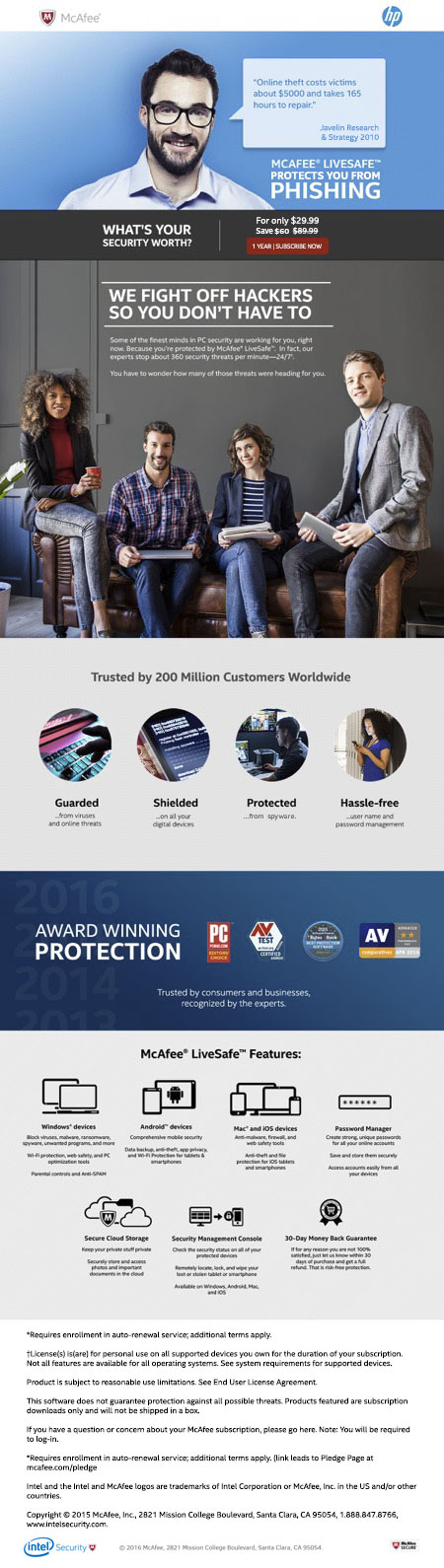
Expert
Some folks prefer to see a friendly face. They trust the expert who gives professional guidance.
VIEW DETAIL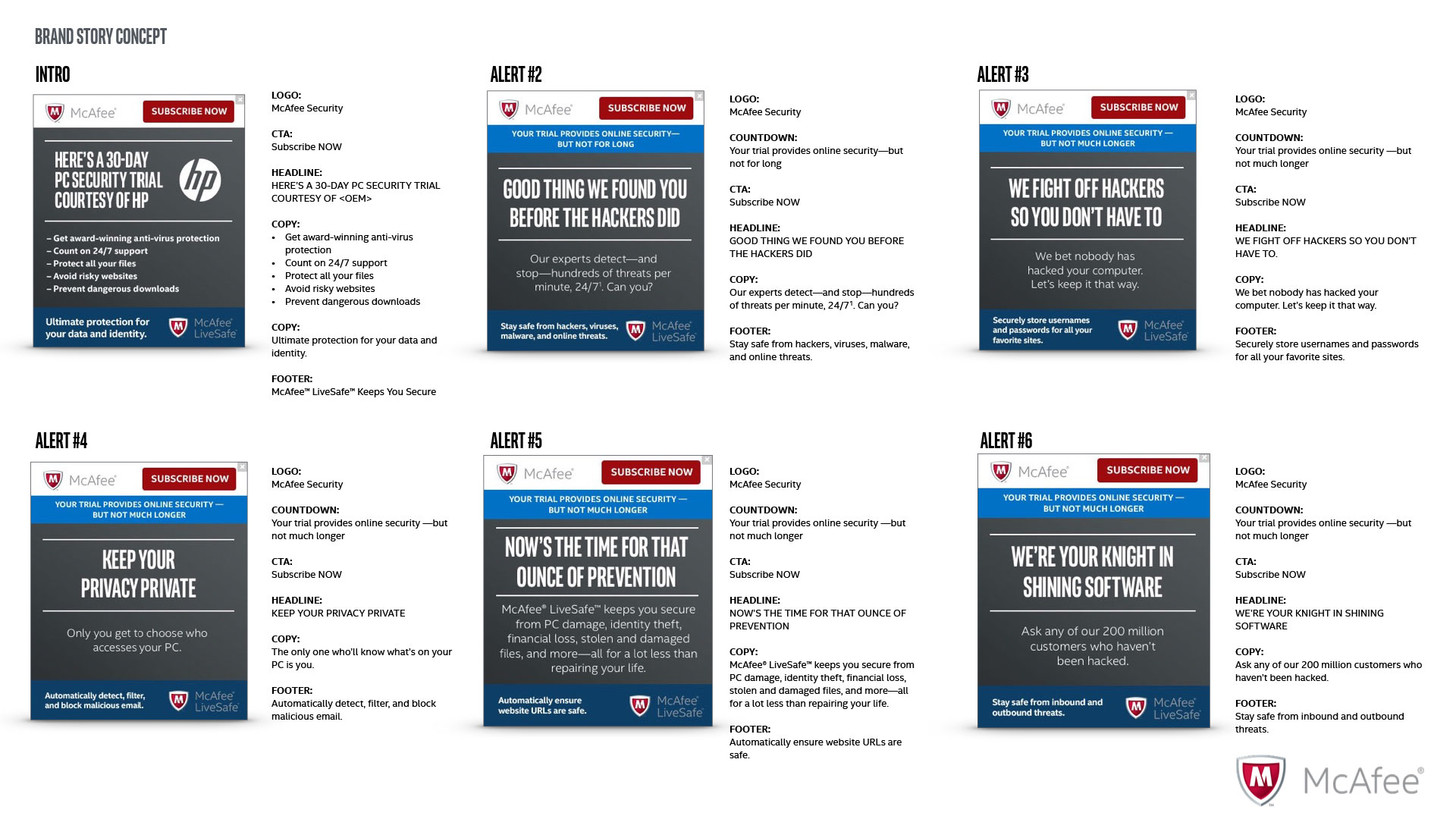
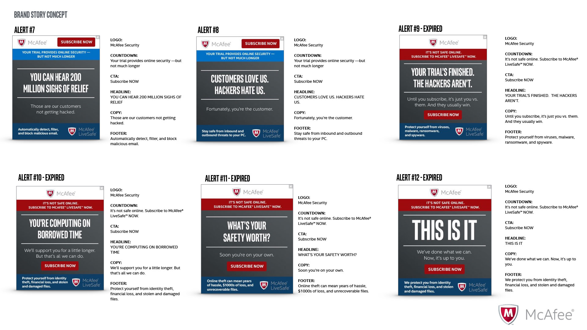
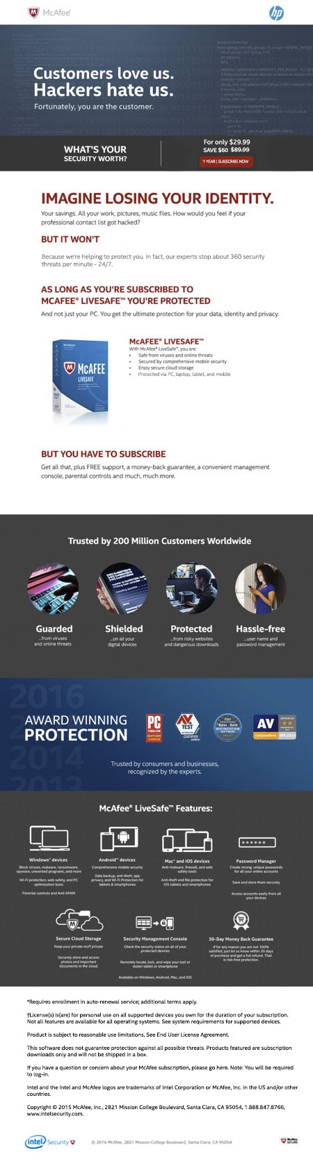
Brand
McAfee is a global brand that customers rely on. This aspect is used in the brand concept.
VIEW DETAILEmail marketing
In addition to the gentle reminders in the app, emails are sent to the customer using a particular cadence. Pestering users every day would be a negative experience, but we had to explore multiple options of communication to portray the importance of staying protected. It was necessary to find a happy medium which informed but didn’t annoy users.
VIEW DETAIL
Landing Pages
Upon interaction with the
Data
Our studies had shown that customers rely on quantitative data to help them make decisions. This concept provided statistics convince users that LiveSafe is valuable.
Expert
There are some customers that trust people more than data, so this concept uses friendly faces to pose as cybersecurity experts, which may captivate user’s attention.
Brand
McAfee is one of the top cybersecurity brands in the world, so the third concept uses brand name recognition to gain customer’s trust.
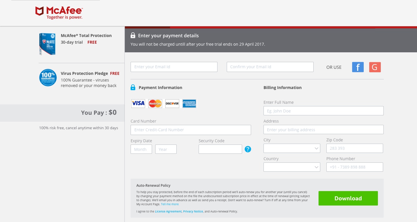
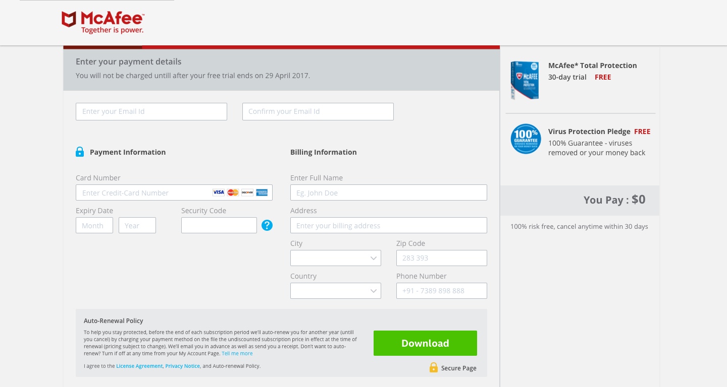
SHOPPING CART EXPERIENCE
The crux of the entire process
Users try LiveSafe because it’s bundled with a newly purchased computer or they downloaded it from McAfee.com. It’s a 30 day trial, after which they’re encouraged to pay for it. When potential customers get to the shopping cart, they could opt out for a number of reasons. My job was to understand those reasons and eliminate them.


Comparative analysis
These examples were collected to demonstrate how other shopping carts collect crucial data to complete the subscription process. I learned which fields were necessary, which were extraneous, and how to present all elements on the page.

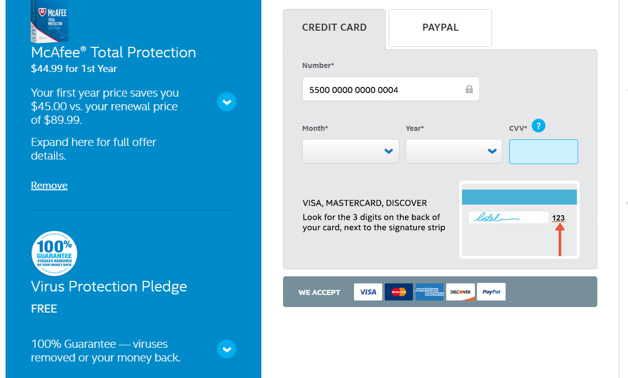
Shopping Cart Options
Through internal user testing, we found that some fields, like a phone number were unnecessary and users found it to be too intrusive. Also, since analytics showed so many abandoned carts, we surmised that customers were attempting to find coupon codes to bring the cost down. We removed the phone number, downplayed the coupon code, but still made it available, and tried to make all the form fields easy to fill out on one page.
-

- Option 1

-

- Option 2

-

- Option 3

-

- Option 4


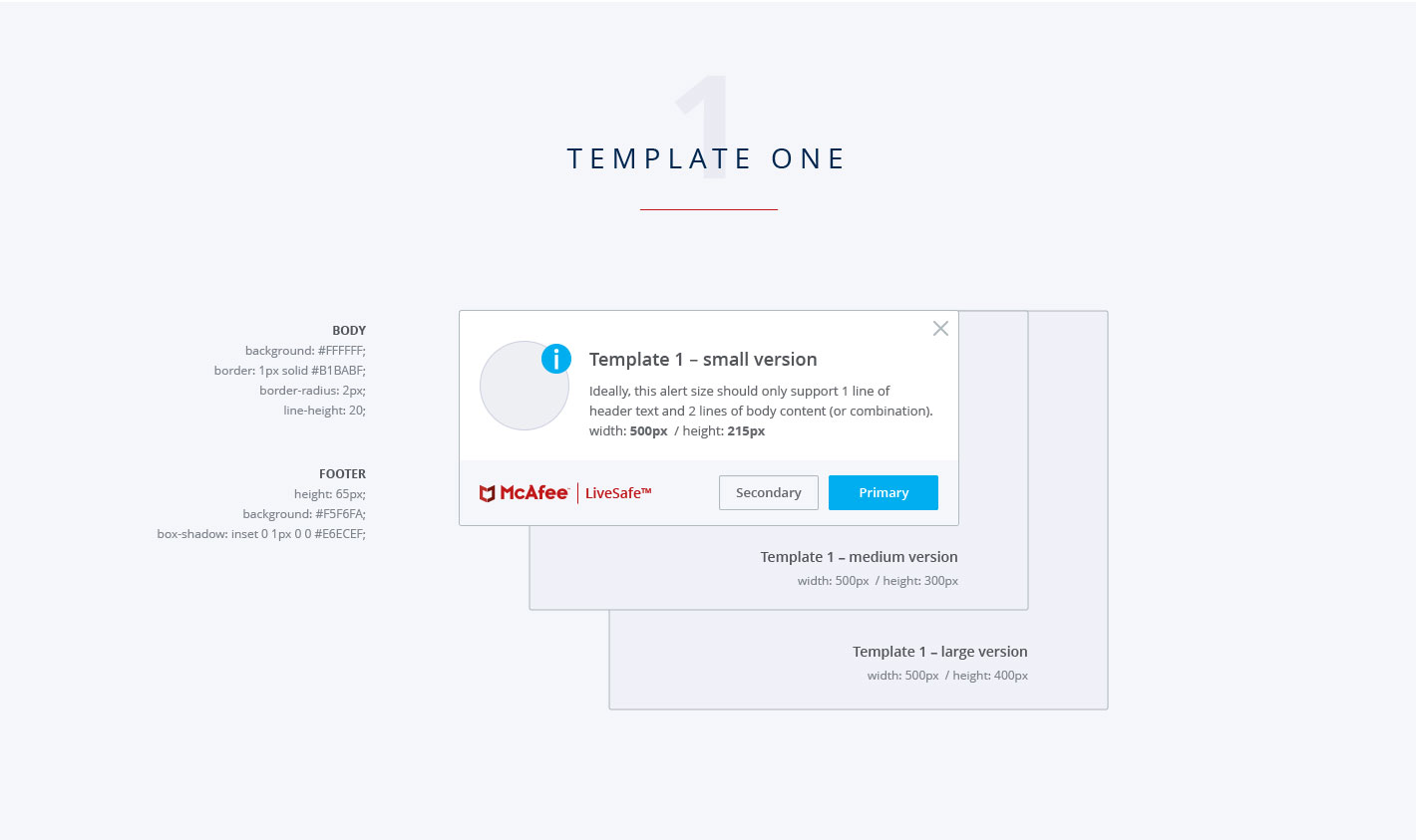
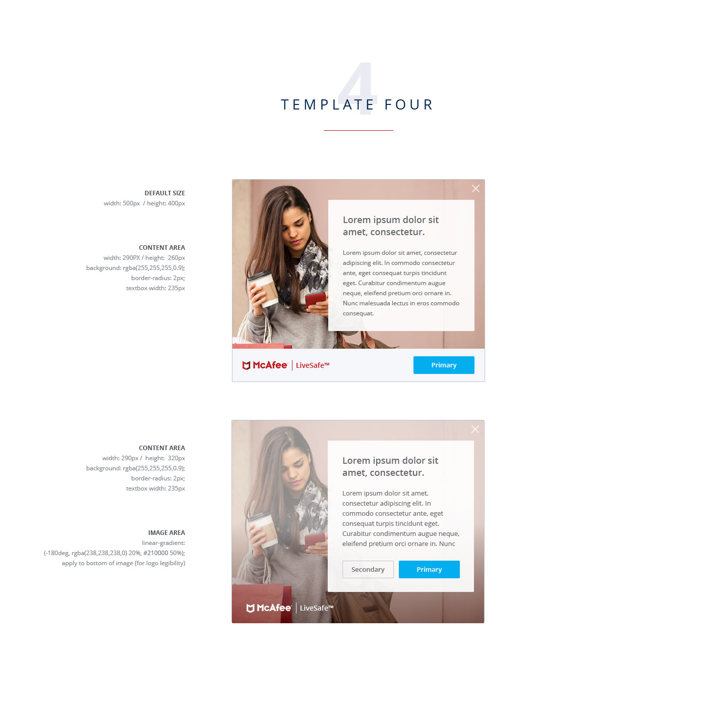
UI Style Guide
As part of a collaborative effort, I had a hand in comprising this style guide based off the corporate design system.


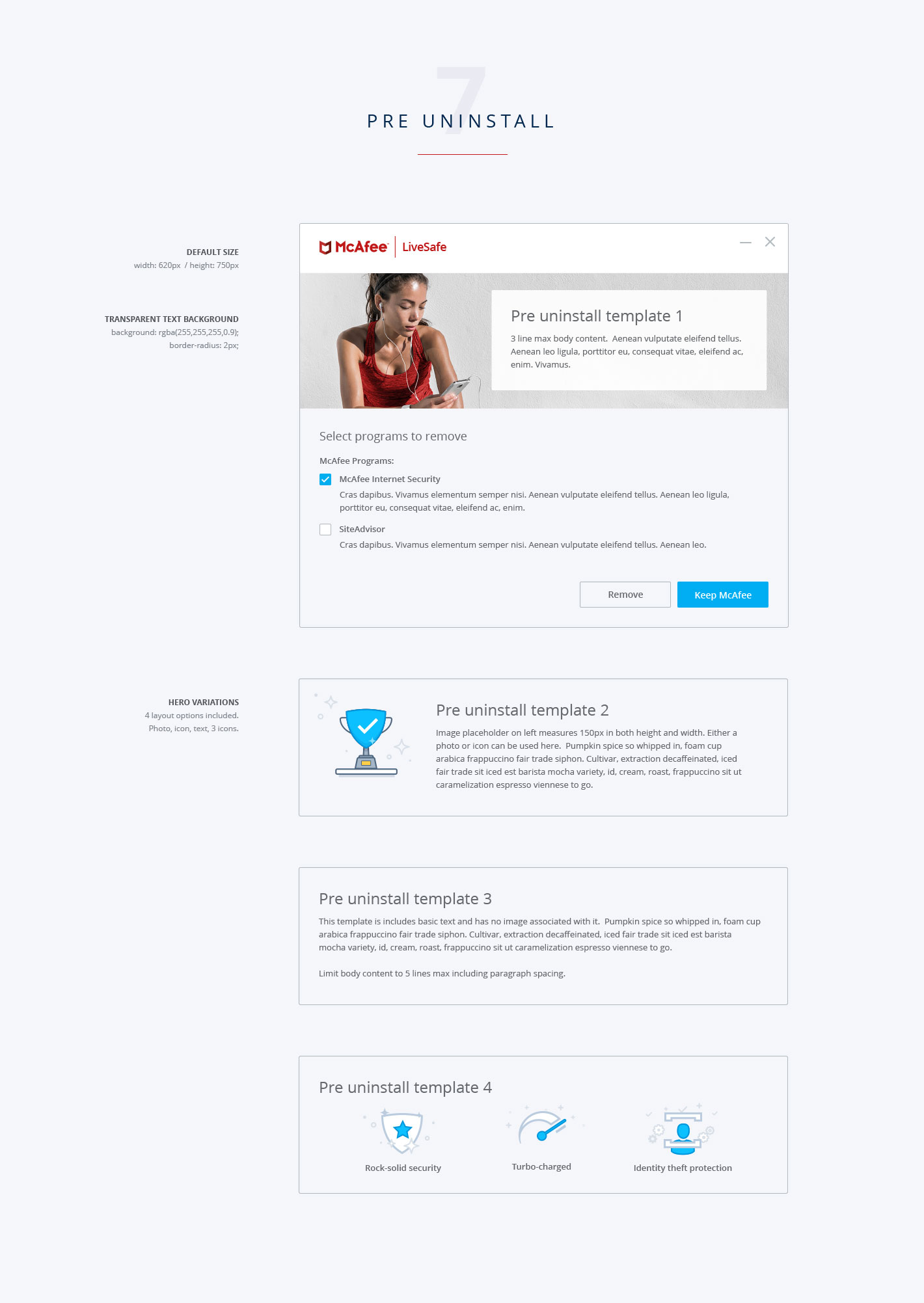
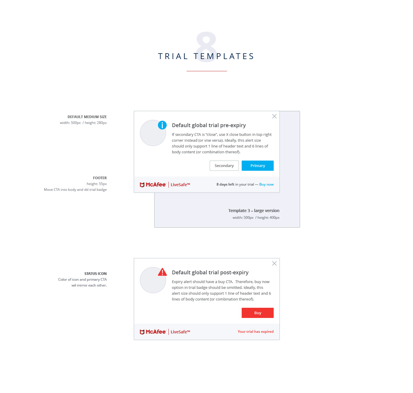
Template Style Guide
To ensure these templates followed brand guidelines and consistency standards, I created this style guide to ensure our team uses them correctly.