Business Process Optimization
The company defines it as a 360 degree view of how company processes affect one another. Creating process models allows for greater insights into process relationships throughout the business.
I define it as a flowcharter with a document repository built in. As the single design manager/UX lead in 2018-19, I was responsible for spearheading user experience initiatives and user interfaces for this extensive B2B enterprise process documentation software platform. I effectively communicated product strategy with interactive Adobe XD prototypes, maintaining interaction and visual consistency. Additionally, I monitored and authorized developer output as a part of the product management team.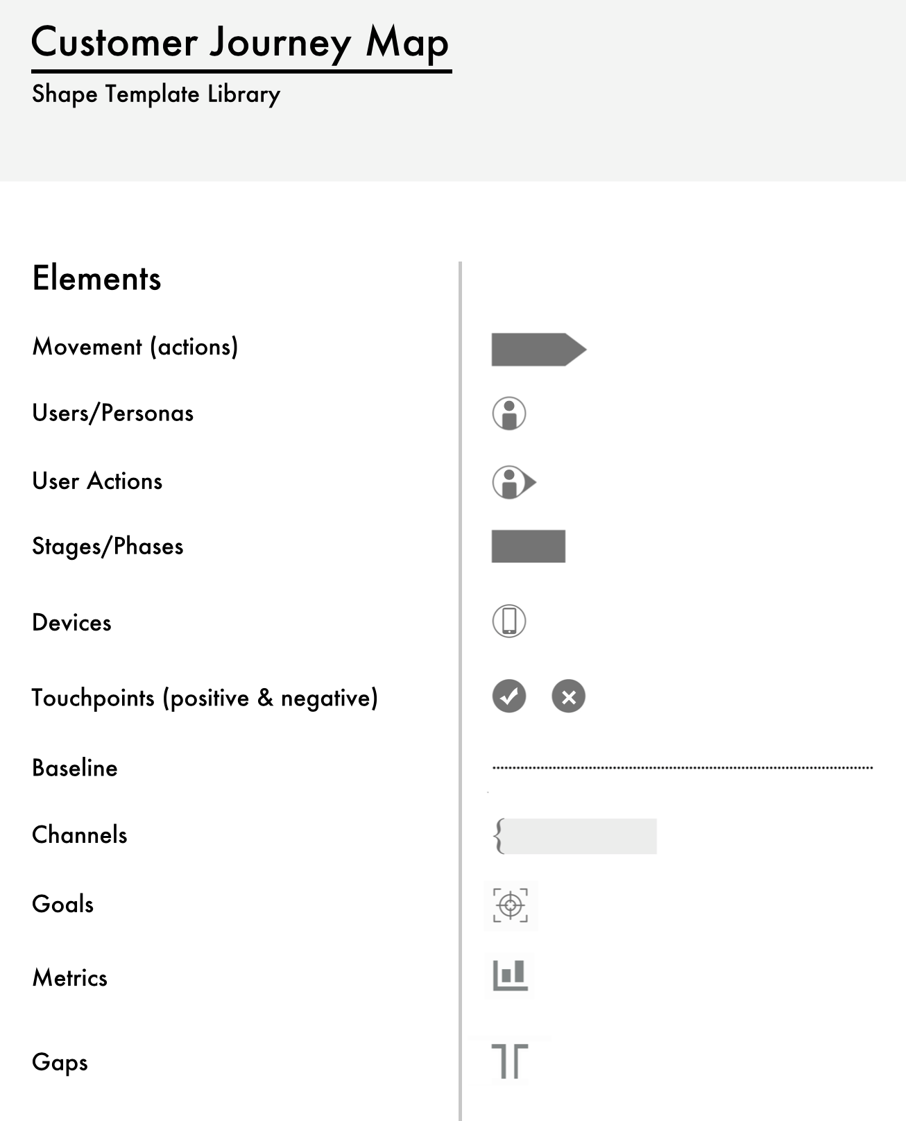


Multilingual
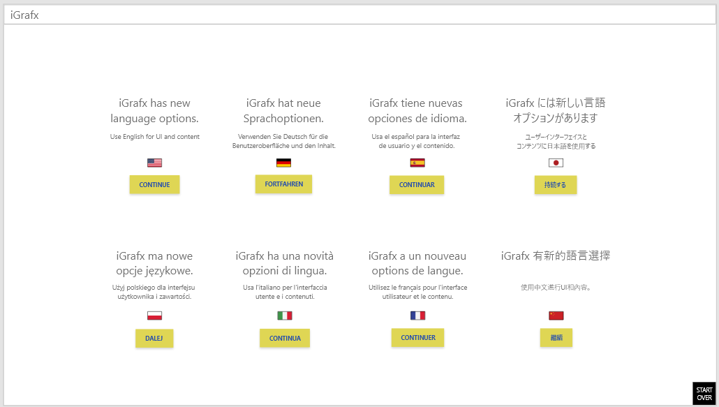
When applying to iGrafx, I was asked to completed a design challenge: Create a mockup/s for how our customers could maintain multiple languages.
Create a mockup/s for how the end user can view “their” or alternative languages. After I presented my concepts and was hired, I was told the hypothetical challenge has been an actual objective of the company for years, but no one was able to figure it out, until I got there.learn more LEARN MORE
Cycle Management
Official documents and processes may need approval from certain folks. They need to be reviewed or endorsed by either that same group or a different group. And sometimes, everyone needs to simply acknowledge that the change has been made. These actions happen in cycles and the complicated combination of them all makes for a challenging project.
LEARN MORE

Journey Mapping
Customers needed the ability to use a variety of shape templates to define a how the product progresses over time. I designed concepts for how this functionality could be built into the iGrafx flow chart diagrammer.
LEARN MORE
Multilingual Discovery
A lot of planning, whiteboarding and strategizing was done before diving into asset delivery. Multiple brainstorming sessions, strategy meetings and validation discussions needed to take place to make sure it would work as intended and that customers would have an intuitive experience.
All the interaction flows, low fidelity visuals and prototypes were created in Adobe XD and shared with the management and development teams.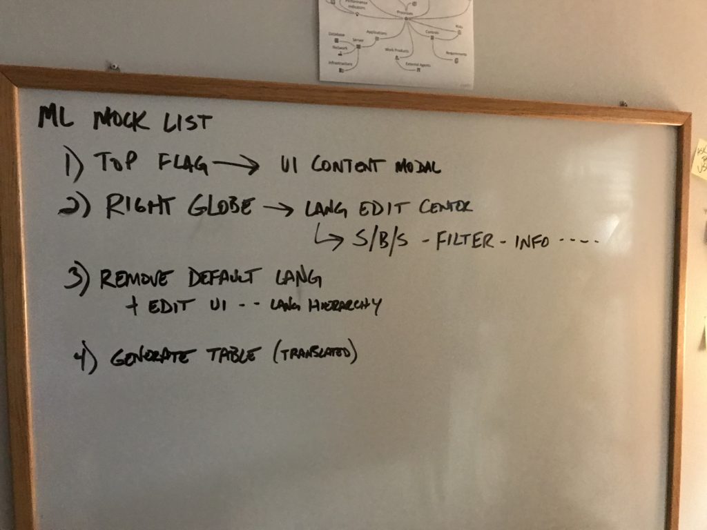
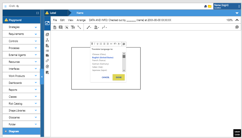
Initial Design
In the canvas of the tool, the user can right click to call a list of text tools. The globe icon was added to this toolbar to allow the user to select from a variety of languages.
Adding Languages
Many iGrafx users are from European countries. The addition of the flags helps users immediately identify the language they’d prefer to add.
Sometimes users need to view the interface of the iGrafx platform in one language and view the canvas content in another language, so we included that functionality.
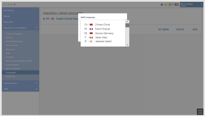


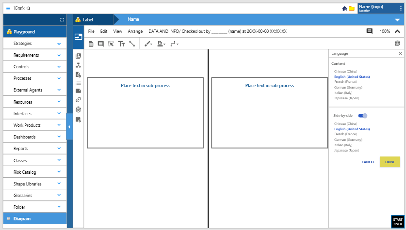
Explanation of Functions
These callout boxes were not integrated into the platform, but used as a descriptor for managment and engineering.
The Side by Side button in the upper right gives the user the ability to view canvas elements in two different languages simultaneously. The grid below the canvas displays the language choices with ability to add more.Seeing the content difference in real time is beneficial for users because it eliminates the guess work. One of the philosophies I work by is “Don’t make me think.” Steve Krug would be proud.
CYCLE MANAGEMENT
Untangling the complications of process communication
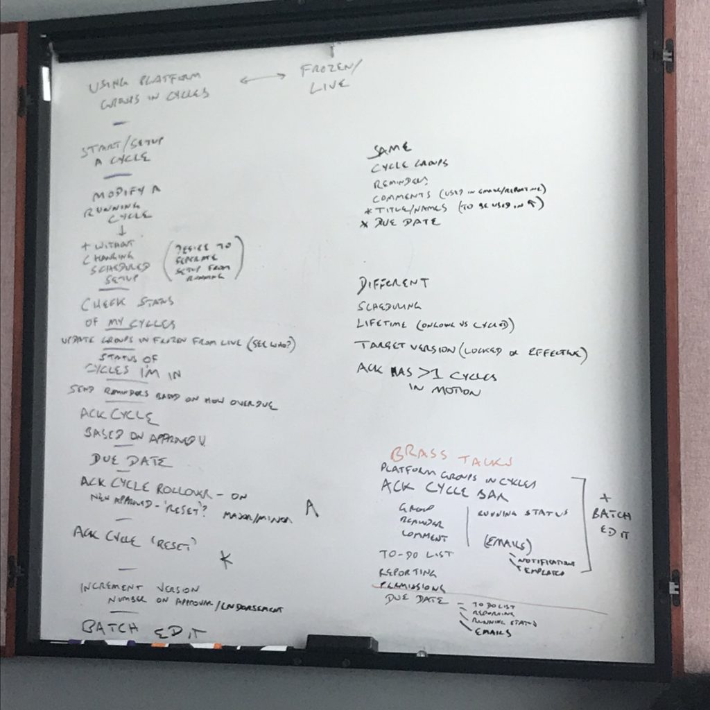
When a process is created, it works best when people know about it. The repeated communication of important processes or documents is cyclical. Does an individual or group approve of a new process and how often should that cycle repeat? Do those users endorse the process after they’ve reviewed it? Or should they simply acknowledge that it exists? The combination of these actions can get complicated very quickly and the overall experience of these features needed to alleviate the user’s effort in this area as much as possible.
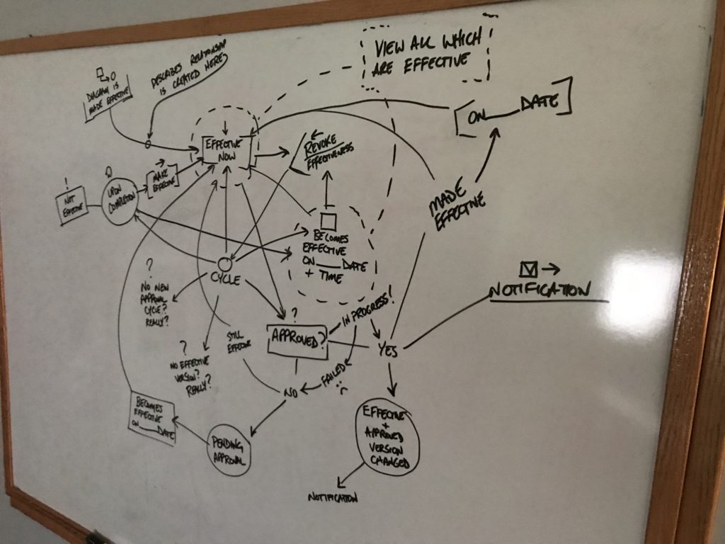

CYCLE MANAGEMENT
A Tangled Web
This Adobe XD prototype shows all the possibilities of the iGrafx platform. The complication of it can lead users down a variety of avenues, so navigation is of the utmost importance. It’s also important that this software solution can handle anything users throw at it, including methods to communicate specific processes.
The clients that use iGrafx often have employees and teams in the thousands, so automating this feature lightens their load and alleviates much of the heavy lifting.
I take on the responsibility of doing that heavy lifting so the user doesn’t have to. I bake all the variations and possibilities into the prototypes to be absolutely thorough, as the development team would ask a litany of questions to ensure every base was covered.Cycle types
Let’s say the leader of a team needs a particular group of folks to understand safety procedures every quarter. That leader would set up a cyclical notice, and possibly a reminder, which is automatically sent to this group once every three months.
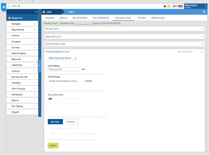
Review cycles request employees to analyze data. Approval cycles require employees to comply with mandates. Endorsement cycles request affirmation of a process. Acknowledgment cycles require employees confirmation.
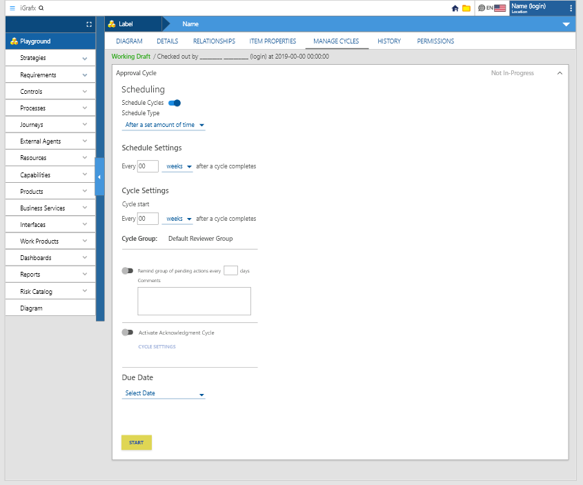
This screen demonstrates scheduling an Approval Cycle.
This one will begin after a set amount of time. It repeats a set number of weeks after a cycle completes. A reminder can be activated for a set number of days after the approval was sent. Finally, the activation and due date can be set at the end before it starts.Journey Mapping
Company leadership made it clear that our customers wanted to have the ability to create product or customer journey maps using the diagramming tool. I took the responsibility to research different types, with definitions for all the sections of content and icons within them, and presented options for how our software could accomplish this task.
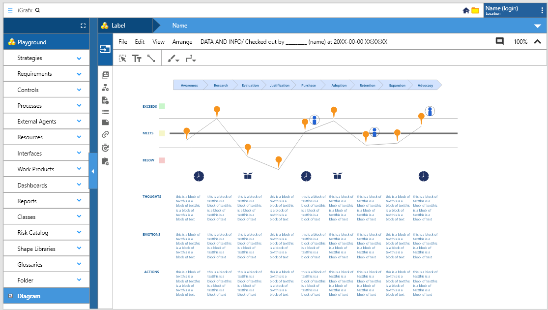
Discovery and Definition
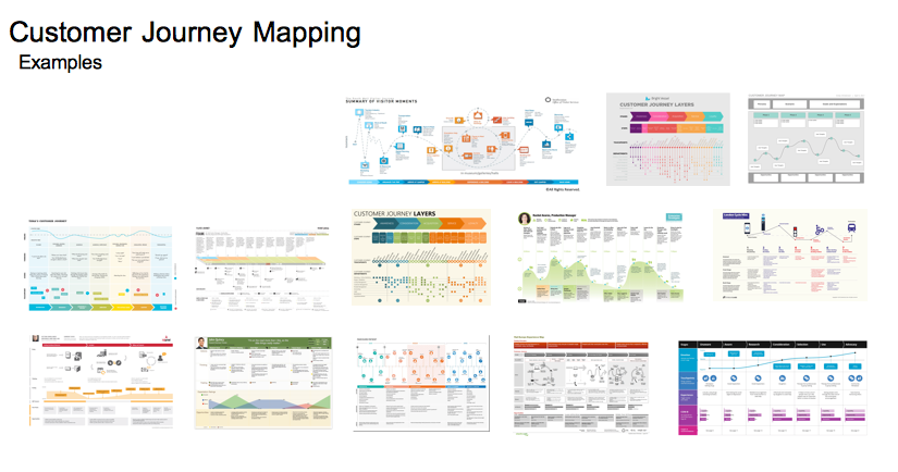
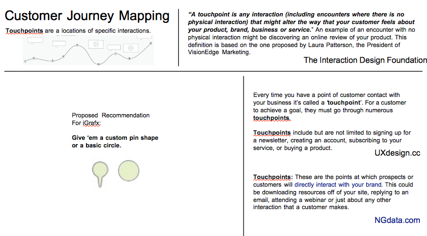
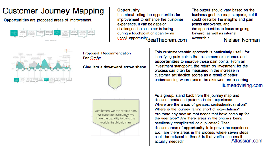
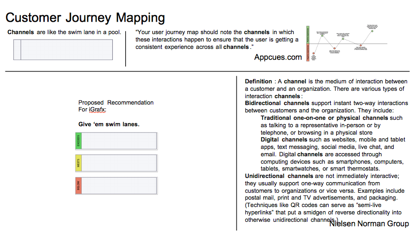
In order to adequately explain what journey maps and are provide examples, I conducted a comparative analysis and outlined all the necessary elements to implement a map.
